Aesthetic templates make it easier to turn ordinary documents, presentations, planners, spreadsheets, and online communities into polished visual experiences. Instead of designing every element from a blank page, you can begin with a coordinated structure and then adapt the colors, typography, images, spacing, and content to match your purpose. The result is not simply something attractive; it is a design system that helps information feel organized and easier to understand.

For students, creators, teachers, business owners, marketers, and professionals, the right visual style can save considerable preparation time while improving consistency. A presentation can feel more confident, a report can become easier to scan, and a spreadsheet can look less intimidating. This guide explains how to choose, customize, and use aesthetic designs across popular platforms while keeping usability at the center.

What Makes Aesthetic Templates Effective?
A good aesthetic template combines visual appeal with practical structure. It usually has a defined color palette, complementary fonts, consistent margins, purposeful image areas, and a hierarchy that tells the reader what to notice first. The strongest designs do not decorate every empty space. Instead, they use contrast, alignment, repetition, and whitespace to make important information stand out.

Visual style is also highly subjective. Someone may prefer soft pastel colors and rounded shapes, while another person may choose monochrome layouts, vintage textures, botanical illustrations, or bold editorial typography. This flexibility is one reason aesthetic design works across many categories. The important principle is to select a style that supports the content rather than competing with it.

Choosing Aesthetic Templates for PowerPoint
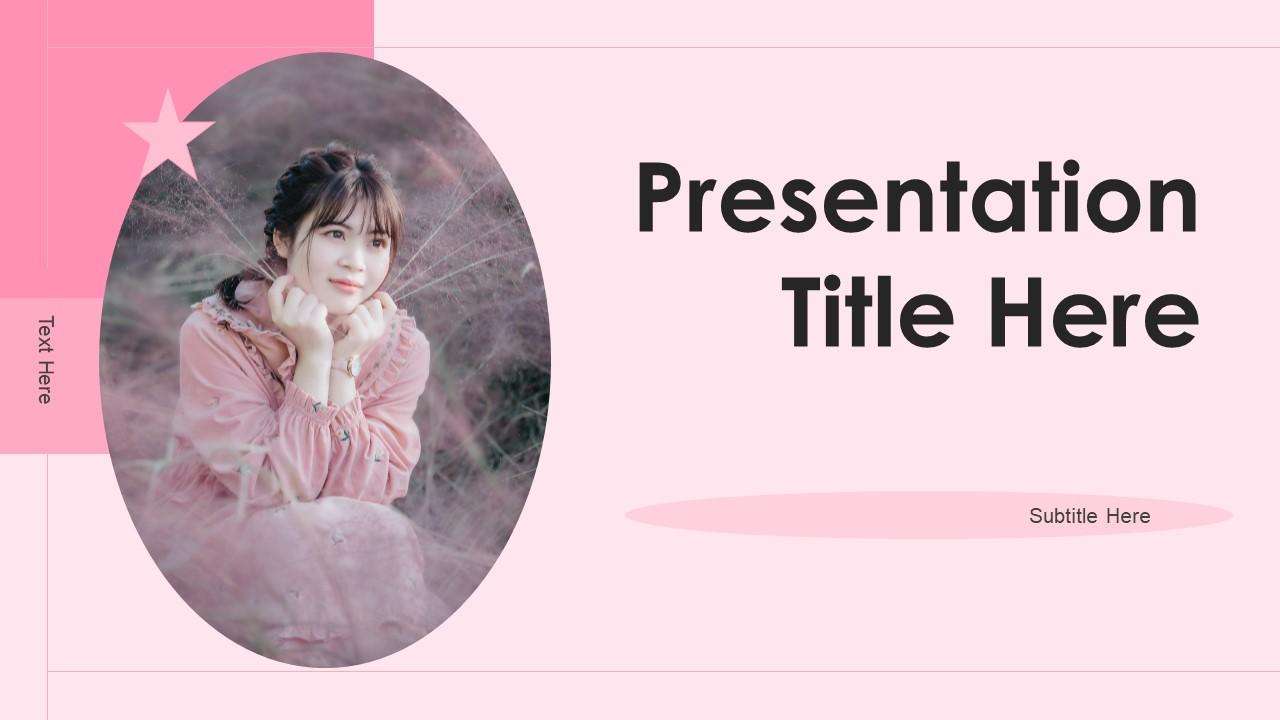
Aesthetic templates for powerpoint are especially useful when a presentation needs to look cohesive from the opening slide to the final summary. Rather than decorating each slide independently, choose a template with a clear visual system. Look for consistent title placement, readable body text, balanced image areas, and layouts that support different content types.

When comparing aesthetic templates for ppt, consider how the design handles charts, tables, timelines, quotations, section dividers, and image-heavy slides. A beautiful title page is not enough if the content slides become crowded. A strong template should give you several layout options while maintaining the same visual language.
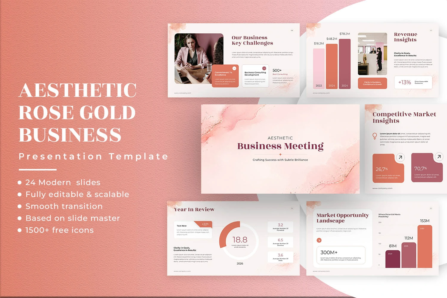
For academic presentations, softer colors and clear typography can create a calm reading experience. For creative portfolios, image-forward layouts may work better. For business presentations, neutral palettes, restrained decoration, and strong hierarchy usually provide a more professional result.
How to Improve a PowerPoint Template
Start by replacing placeholder content rather than immediately changing every design element. Once your information is in place, evaluate the visual balance. If one slide contains too much text, split it into two slides or convert part of the explanation into a diagram. Keep headings short and use visual emphasis only for genuinely important information.

Typography deserves special attention. A decorative font can work beautifully for a title, but it may reduce readability in paragraphs or data labels. Pair expressive display typography with a simple body font. Maintain consistent font sizes so the audience can immediately recognize titles, subtitles, labels, and supporting text.
Aesthetic Templates in Canva
Aesthetic templates in canva are useful for people who want a visual editor with flexible customization. Canva-style layouts commonly cover presentations, social graphics, planners, documents, posters, portfolios, worksheets, and many other formats. The main advantage is the ability to adjust the design visually while keeping the overall composition intact.

When working with a Canva design, begin with the template structure instead of changing everything immediately. Replace the sample photographs, adjust the palette to match your brand, and then refine typography. If the design contains decorative elements, ask whether each element supports the message. Removing two or three unnecessary objects can often make the finished composition stronger.

Another useful approach is to establish a small design system before editing multiple pages. Choose two or three main colors, one heading font, one body font, and a consistent image treatment. This prevents individual pages from developing unrelated visual styles.

Aesthetic Templates for Word Documents
Aesthetic templates for word can be particularly useful for reports, proposals, resumes, study notes, articles, newsletters, and branded documents. Word documents often become visually dull when every page uses the same paragraph structure. A thoughtfully designed template can introduce better hierarchy through headings, page spacing, accent colors, cover pages, and carefully positioned visual elements.

The most important consideration for Word is readability. Decorative borders and large illustrations should never make the main text difficult to follow. Use visual elements around the edges or in dedicated sections while preserving generous space for the actual content.

For professional documents, neutral colors such as cream, charcoal, muted green, dusty blue, or warm brown can create a refined appearance. For school notes or creative journals, pastel colors and playful illustrations may be more appropriate.
Aesthetic Templates for Spreadsheets and Excel
Aesthetic excel templates can make structured information easier to scan without turning a spreadsheet into a decorative poster. The goal is visual organization. Use one accent color for headings, another subtle shade for categories, and enough whitespace to distinguish separate sections.

A budget sheet, content calendar, inventory tracker, project planner, or financial dashboard can all benefit from this approach. Instead of applying color to every cell, reserve stronger contrast for totals, key indicators, deadlines, or sections that require attention.
Charts should also follow the same visual language. A chart with ten unrelated colors can look chaotic even when the underlying data is accurate. Use a limited palette and highlight only the series that matter most to the decision being made.
Aesthetic Templates for Discord Communities
Aesthetic templates discord designs are useful when creating a community with a recognizable identity. The aesthetic can influence channel naming, category organization, role colors, welcome messages, emojis, banners, and rules. A cohesive visual identity makes a server feel intentional rather than assembled from unrelated parts.
For example, a botanical community might use muted greens, cream, leaf-inspired icons, and simple channel names. A retro community could use darker colors, nostalgic symbols, and bold typography. A study community may benefit from soft blues, lavender, clean categories, and simple productivity-oriented naming.

The key is consistency. Avoid giving every category a different visual identity. Choose one central concept and let smaller details reinforce it.
How to Customize Aesthetic Templates Copy and Paste Designs
Aesthetic templates copy and paste workflows can be convenient when you repeatedly create similar pages or sections. However, copying visual elements without considering spacing can quickly produce inconsistent layouts. Before duplicating a design, identify the parts that should remain fixed and the parts that should change.
- Keep consistent: primary colors, heading styles, margins, icon treatment, and recurring visual patterns.
- Change intentionally: photographs, examples, section titles, charts, and supporting illustrations.
- Review alignment: copied elements should follow the same invisible grid as the original design.
- Check readability: decorative elements should never overpower the main information.
Popular Aesthetic Styles to Consider
There is no single definition of an aesthetic design. Different visual directions can communicate completely different moods. Selecting the right one begins with understanding the personality of the project.
- Minimalist: generous whitespace, restrained colors, clean typography, and simple shapes.
- Pastel: soft pink, blue, lavender, green, peach, or cream tones for a gentle visual mood.
- Vintage: aged textures, muted colors, serif typography, and nostalgic imagery.
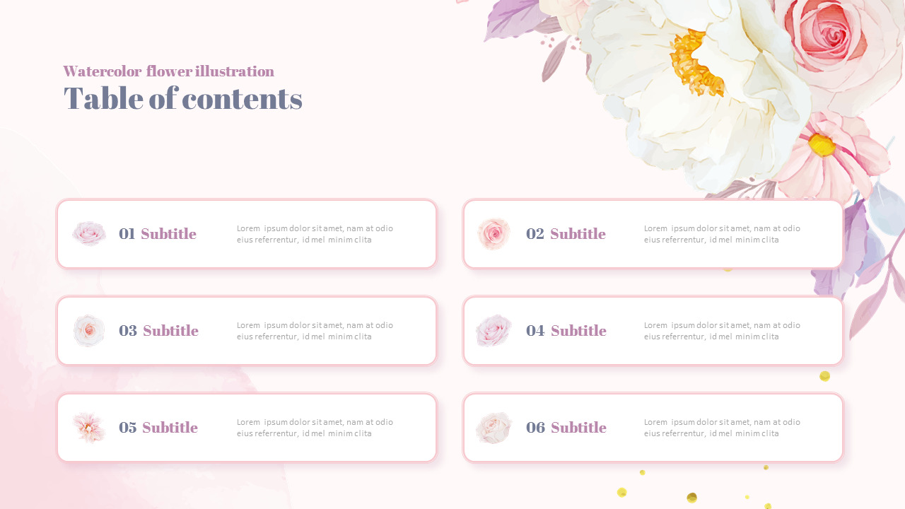
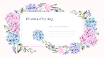
- Botanical: leaves, flowers, organic shapes, and natural color palettes.
- Editorial: strong typography, asymmetric layouts, photography, and magazine-inspired composition.
- Scrapbook: layered photographs, paper textures, handwritten details, tape effects, and playful arrangements.
How to Choose the Right Template
The best template is not necessarily the most decorative one. It is the design that makes your content easier to present and your audience easier to follow. Start by identifying the purpose, audience, platform, amount of information, and desired mood.

Match the Visual Style to the Audience
A school project can support a playful or colorful direction, while a financial report may need a restrained visual system. A creative portfolio can use expressive photography, whereas a formal proposal usually benefits from a quieter composition. The design should feel appropriate before it feels trendy.

Check Editing Flexibility
Before committing to a template, inspect whether it contains enough layout variations for your project. A presentation with only one title layout may become repetitive. A document with rigid text areas may become frustrating when paragraphs are longer than expected. Flexibility matters because real content rarely fits placeholder text perfectly.
Common Mistakes When Using Aesthetic Templates
One common mistake is choosing appearance before purpose. A design can look impressive in a preview but become difficult to use once real information is inserted. Another mistake is changing too many elements at once. When colors, fonts, spacing, images, and layouts are all modified simultaneously, the original visual balance can disappear.
- Using too many fonts in one project.
- Adding decorative elements to every available space.
- Using low-contrast text on pale backgrounds.
- Ignoring mobile or projected viewing conditions.
- Using inconsistent image proportions across pages.
- Changing colors without checking accessibility and readability.
- Allowing decorative design to compete with the main message.
Practical Workflow for Creating a Polished Design
A simple workflow can make customization much more efficient. First, define the purpose of the project in one sentence. Next, select a visual direction that matches the audience. Then choose the template structure and insert the real content. Only after the information is organized should you refine colors, images, typography, and decorative details.

After the first draft, review the entire project as a single visual system. Look for repeated patterns, inconsistent spacing, weak contrast, oversized headings, and pages that feel noticeably heavier than the rest. Small adjustments at this stage can make the finished design feel substantially more professional.
Frequently Asked Questions About Aesthetic Templates
What are aesthetic templates?
Aesthetic templates are pre-designed layouts built around a recognizable visual style. They can include coordinated typography, colors, shapes, imagery, spacing, and page structures for presentations, documents, spreadsheets, planners, communities, and other creative projects.
Can aesthetic templates be used for professional projects?
Yes. Professional design does not have to be visually plain. A restrained palette, strong hierarchy, consistent typography, and purposeful imagery can create an attractive appearance while preserving clarity and credibility.
How do I make an aesthetic presentation easier to read?
Reduce unnecessary text, create strong contrast, maintain generous spacing, and use visual emphasis selectively. Every slide should have one clear primary message rather than competing visual focal points.
What colors work well for aesthetic designs?
Neutral beige, cream, muted green, dusty blue, lavender, soft pink, charcoal, and warm brown are versatile choices. The best palette depends on the subject, audience, brand personality, and intended mood.
Can one template work across different software?
Sometimes. A design concept can be recreated across PowerPoint, Word, Canva, Google Slides, and spreadsheet software, but individual features and formatting behavior can differ. Always review the final layout in the software where it will actually be used.
Final Tips for Better Aesthetic Templates
The strongest aesthetic templates balance beauty with function. Start with a clear purpose, select a visual language that matches your audience, and customize the design gradually. Prioritize typography, spacing, contrast, and hierarchy before adding decorative elements. For presentations, focus on storytelling and slide variety. For documents, protect readability. For spreadsheets, use color to organize information rather than simply decorate cells. For online communities, create a consistent identity that makes navigation intuitive.
If you approach templates as flexible design systems rather than rigid artwork, you can create polished results while keeping your own voice visible. Choose a structure that supports the content, make intentional adjustments, and review the complete project as one visual experience. That combination of consistency, usability, and personality is what turns a simple template into an effective design.