A welcome banner gives visitors a clear and friendly first impression. You can use one on a website, at an event, in a classroom, or inside a business. A simple design can also guide visitors toward useful information.
However, an effective banner needs more than attractive graphics. It needs a clear message, readable text, balanced colors, and enough white space. Therefore, good design starts with a clear purpose.
In this guide, you will learn how to create a professional welcome banner. You will also discover practical ideas for websites, businesses, events, and printable displays.
What Is a Welcome Banner?
A welcome banner is a graphic that greets visitors, customers, guests, students, or members. It can appear at the top of a webpage or in a physical location. It can also work as a social media graphic or event sign.
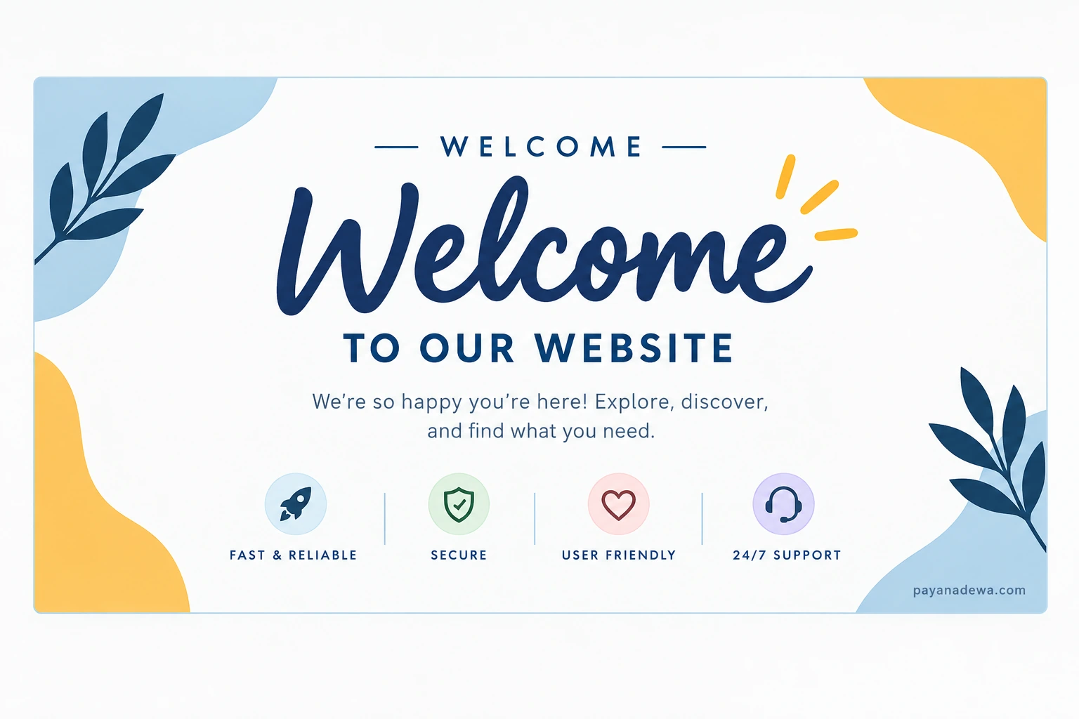
The main message is usually short. For example, you might write “Welcome to Our Website” or “Welcome to Our Event.” You can then add a short sentence that explains what visitors can expect.
Common Types of Welcome Banners
- Website welcome banner: Greets visitors on a homepage or landing page.
- Printable welcome banner: Works well for offices, schools, parties, and events.
- Business welcome banner: Introduces customers to a company or service.
- Event welcome banner: Welcomes guests at conferences, weddings, and celebrations.
- Social media welcome graphic: Creates a friendly introduction on social platforms.
- Welcome banner template: Provides a reusable layout for different messages.
Why Use a Welcome Banner?
A clear welcome message helps visitors understand where they are. It also creates a friendly tone from the start. For this reason, a banner can support both communication and branding.
On a website, a welcome banner can introduce your business and guide visitors. At an event, it can identify the occasion and make guests feel comfortable. In a classroom, it can create a positive learning environment.
Most importantly, the banner should answer one simple question: What should visitors notice first? Once you answer that question, the design becomes easier to plan.
Essential Elements of a Good Welcome Banner
1. Use a Clear Main Message
Start with a short and direct headline. The word “Welcome” can work well as the main heading. Then, add a short supporting message when needed.
For example, a business might use “Welcome to Our Website” and then explain its main service. An event might show the event name below the greeting. Keep both lines easy to scan.
2. Choose Readable Fonts
Typography affects both style and usability. A decorative font can add personality to a heading. However, body text should remain simple and easy to read.
- Use one or two font families.
- Choose strong contrast between text and background.
- Use a larger size for the main heading.
- Keep supporting text short.
- Leave enough space around every text block.
As a result, visitors can understand the message without extra effort.
3. Select a Balanced Color Palette
Color can change the mood of a banner. Blue can create a calm and professional feel. Warm gold can add energy and friendliness. Neutral backgrounds can keep the design clean.
Try to use two or three main colors. Also, check the contrast before publishing or printing the design. Clear contrast helps people read the message quickly.
4. Add Relevant Visuals
Simple illustrations, icons, shapes, leaves, or photographs can add visual interest. However, every element should support the main message.
For example, a business can use brand imagery. A wedding can use elegant floral details. A classroom can use friendly illustrations. Therefore, choose visuals that match the audience and purpose.
5. Create a Strong Visual Hierarchy
A strong layout guides the visitor from one element to the next. First, the visitor should see the main greeting. Next, they should notice the supporting message. Finally, they can see a button, logo, or secondary detail.
White space also matters. Empty areas help important elements stand out. Therefore, do not fill every part of the banner.
How to Create a Welcome Banner Template
Step 1: Define the Purpose
First, decide where you will use the banner. A website header needs a different layout from a printed event sign. The final use also affects the size, text, and image quality.
Step 2: Write the Main Message
Next, write a short greeting. You can use phrases such as “Welcome to Our Website,” “Welcome to Our Community,” or “Welcome to the Event.” Then, add only the details that visitors need.
Step 3: Build a Simple Layout
Place the main heading in the most visible area. Put the supporting text below it. Then, add decorative elements around the edges. Keep the layout balanced and give each element enough room.
Step 4: Add Your Branding
For a business banner, include your logo and brand colors. You can also match the fonts used on your website. This approach creates a consistent brand experience.
Step 5: Test the Design
Finally, view the banner at its real size. Check it on a desktop and a mobile screen when it is for a website. For print, check a small proof first. Also, review every name, date, and contact detail.
Welcome Banner Ideas for Different Uses
A flexible template can work in many settings. You only need to change the message and a few visual details.
- Business website: “Welcome to Our Website — Discover Our Products and Services.”
- Online store: “Welcome — Explore Our Latest Collection.”
- Office reception: “Welcome to Our Office — We’re Glad You’re Here.”
- School classroom: “Welcome to Our Classroom — Learn, Create, and Grow.”
- Wedding reception: “Welcome to Our Celebration — Thank You for Being Here.”
- Conference: “Welcome to the Event — Connect, Learn, and Discover.”
- Community group: “Welcome to Our Community — Everyone Has a Place Here.”
How to Make a Printable Welcome Banner
A printable welcome banner needs clear text and high image quality. Before printing, confirm the final dimensions. Then, prepare the design at a suitable resolution.
- Use high-resolution graphics.
- Keep important text away from the edges.
- Choose fonts that remain readable in print.
- Check the printer’s color requirements.
- Print a small proof before a large order.
- Check spelling and dates one more time.
For large signs, ask your printer about bleed, file format, color mode, and final dimensions. These requirements can vary between printers.
How to Use a Welcome Banner on a Website
A website welcome banner should look good on both desktop and mobile screens. It should also help visitors understand the page quickly.
Keep the Main Message Visible
Place the main greeting where visitors can see it without unnecessary scrolling. Keep the headline short. Then, use one supporting sentence if needed.
Make the Design Responsive
A wide desktop banner may not fit a phone screen. Therefore, use a responsive layout. Let text, images, and buttons adjust to different screen sizes.
Add a Useful Call to Action
A call to action can guide visitors to the next step. Examples include “Learn More,” “Explore Now,” “Shop Now,” and “Get Started.” Choose an action that matches the page goal.
Common Welcome Banner Mistakes
Even a beautiful banner can fail when visitors cannot understand it quickly. Fortunately, most problems are easy to avoid.
- Too much text: Keep the message short and focused.
- Low contrast: Make the text easy to see.
- Too many fonts: Use a simple type system.
- Too many graphics: Keep decorative elements under control.
- Weak hierarchy: Make the main message the most visible element.
- Poor mobile layout: Test the banner on smaller screens.
- Inconsistent branding: Match the banner with your existing visual identity.
Tips for a More Professional Welcome Banner
You do not need a complex design to create a professional result. In fact, simple layouts often communicate more clearly.
Start with one strong message. Next, choose a small color palette and readable fonts. Then, add a few useful visual elements. Finally, review the spacing and alignment.
Consistency is also important. Match the banner with your website, printed materials, or brand style. This makes the design feel like part of the same visual system.
It can also help to ask another person to review the banner. Ask what they notice first. Then, ask what they think the message means. Their answers can reveal areas that need improvement.
Final Thoughts
A welcome banner can make a website, business, classroom, or event feel more inviting. The best designs focus on clarity, readable typography, balanced colors, and useful visual details.
Start with a clear purpose. Then, write a short message and build a simple layout. After that, adapt the design to its final use. Test it on the correct screen or print size before publishing.
With these practical steps, you can create a welcome banner that looks polished, communicates clearly, and gives visitors a warm first impression.