Your LinkedIn profile is often the first place people look when they want to learn more about you professionally. While your profile photo and headline are important, your LinkedIn banner is one of the largest visual elements on the page. A well-designed banner can communicate your personal brand, expertise, career focus, or business message in just a few seconds.
A professional LinkedIn banner does not need to be complicated. The most effective designs usually combine a clear message, attractive visuals, readable typography, and consistent branding. Whether you are a job seeker, entrepreneur, freelancer, consultant, creator, or business professional, the right banner can make your profile look more polished and memorable.
In this guide, you will learn what makes a great LinkedIn banner, what size to use, what information to include, and how to create a design that looks professional on different devices.
What Is a LinkedIn Banner?
A LinkedIn banner, also called a LinkedIn background photo or LinkedIn cover image, is the wide image displayed at the top of your LinkedIn profile. It sits behind your profile photo and provides additional space for visual branding and messaging.
Unlike your profile picture, which mainly represents you, your banner can communicate more about your professional identity. For example, it can showcase your industry, services, portfolio, company, achievements, or personal brand.
A strong LinkedIn background image should support the information already shown on your profile rather than competing with it. The goal is to create a visual introduction that feels professional and intentional.
Why a Professional LinkedIn Banner Matters
Your LinkedIn profile contains a lot of information. Visitors may see your name, headline, profile photo, About section, experience, skills, and other details. A banner adds another visual layer that can help create a stronger first impression.
A thoughtfully designed banner can help you:
- Strengthen your personal brand.
- Make your profile visually distinctive.
- Communicate your professional specialty.
- Promote a business, service, or portfolio.
- Showcase your design style and creativity.
- Make your profile look more complete and polished.
- Reinforce the message in your LinkedIn headline.
However, the banner should remain simple. Too much text, excessive decoration, or poor contrast can make the design difficult to understand.
LinkedIn Banner Size and Design Specifications
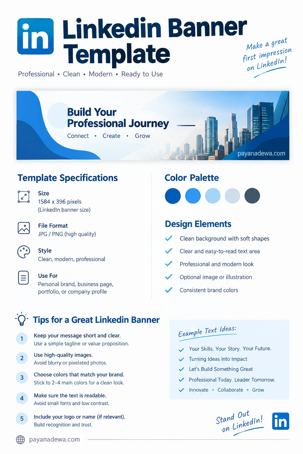
Before designing your banner, start with the correct dimensions. A commonly used LinkedIn personal profile banner size is 1584 × 396 pixels, which provides the wide format needed for the profile header.
For the best result, create your design at a high resolution and export it as a high-quality JPG or PNG. Always check the finished image on both desktop and mobile because the visible area can vary between devices.
When creating your LinkedIn banner template, keep important text and branding elements away from areas that may be covered by your profile photo or cropped on smaller screens.
What Should You Put on a LinkedIn Banner?
The content of your banner depends on your professional goals. You do not need to include everything about yourself. Instead, choose one main message that visitors can understand quickly.
1. Your Professional Tagline
A short tagline can immediately tell visitors what you do. For example, a marketing professional might use a phrase such as “Turning Ideas Into Meaningful Growth”.
Keep your tagline short and readable. A concise statement usually has more visual impact than a long paragraph.
2. Your Name or Personal Brand
If you are building a personal brand, your name can be incorporated into the design. This can work especially well for consultants, coaches, freelancers, designers, writers, speakers, and content creators.
3. Your Business or Service
Entrepreneurs and business owners can use the banner to communicate what their company does. A simple service statement can help visitors understand the purpose of the business without reading the entire profile.
4. Your Industry or Expertise
Visual elements can reinforce your professional specialty. For example, a software developer might use subtle technology-inspired graphics, while a photographer could use an elegant visual related to photography.
5. A Call to Action
In some cases, a simple call to action can be useful. Examples include “Let’s Connect,” “Explore My Work,” or “Building Better Digital Experiences.”
Avoid turning the banner into an advertisement. LinkedIn is primarily a professional networking platform, so the message should feel useful and credible.
How to Design a Professional LinkedIn Banner
Choose a Clear Visual Direction
Start by deciding what you want your profile to communicate. A corporate professional may prefer a clean and minimal layout. A creative professional may choose a more expressive composition. A business owner might use brand colors and a subtle representation of their services.
Once you have a direction, keep the visual style consistent. This makes the banner feel connected to the rest of your personal brand.
Use a Simple Color Palette
Too many colors can make a banner look busy. Instead, choose two to four complementary colors. If you already have brand colors, use them consistently.
Blue, gray, white, and neutral tones are popular choices for professional designs. However, there is no single color combination that works for everyone. Your palette should reflect your industry and personal identity.
Use Readable Typography
Your banner may look excellent in a design editor but become difficult to read once uploaded to LinkedIn. Choose a clean font and use sufficient size and contrast.
For better readability:
- Use one or two font families.
- Keep important text short.
- Use strong contrast between text and background.
- Avoid overly decorative fonts.
- Leave enough empty space around the text.
Leave Enough Negative Space
Negative space is the empty area surrounding your design elements. It gives your banner room to breathe and helps important information stand out.
A common mistake is filling every part of the banner with text, icons, photos, and shapes. Instead, use empty space intentionally. A simple composition often looks more professional than an overcrowded one.
LinkedIn Banner Ideas for Different Professionals
Your ideal banner design depends on your career goals. Here are several ideas you can adapt.
- Job seekers: Use a professional tagline related to your target industry and keep the design clean.
- Freelancers: Highlight your primary service, such as web design, writing, consulting, or photography.
- Entrepreneurs: Use your brand colors and a concise statement about your business.
- Designers: Showcase a small portion of your visual style without making the banner overwhelming.
- Consultants: Use a short value proposition that explains the type of problems you solve.
- Content creators: Include your niche or content focus with a memorable visual identity.
- Executives: Use sophisticated typography, restrained colors, and a clear leadership-focused message.
Common LinkedIn Banner Mistakes to Avoid
Even a high-quality template can look ineffective if the content is poorly arranged. Watch out for these common problems.
Too Much Text
A banner is not the right place for a complete biography. Keep the message concise and let the rest of your LinkedIn profile provide the details.
Low-Quality Images
Blurry or pixelated images can make your profile appear less polished. Always start with a high-resolution image and export it at an appropriate quality.
Important Elements Too Close to the Profile Photo
Your profile photo occupies part of the banner area. Therefore, avoid placing essential text directly behind or next to the profile picture.
Inconsistent Branding
If your website, portfolio, business cards, and social profiles use a particular visual identity, your LinkedIn banner should complement that identity. Consistent colors, typography, and messaging can make your professional presence feel more cohesive.
Ignoring Mobile Viewing
Many people access LinkedIn from mobile devices. Therefore, test your banner on different screen sizes before considering the design finished.
How to Create a LinkedIn Banner Template
Creating a reusable LinkedIn banner template can save time. Instead of designing a new banner from scratch whenever your role or message changes, create a flexible layout with editable elements.
Start with the correct canvas size. Then create separate areas for your headline, supporting text, logo, decorative elements, and background image. Keep these components organized so you can easily replace them later.
A reusable template can include:
- A consistent brand color palette.
- A primary and secondary font.
- A dedicated text area.
- A logo placement area.
- A photo or graphic area.
- Optional tagline and call-to-action sections.
This approach is especially useful for businesses and professionals who regularly update their LinkedIn branding.
Practical Tips for a Better LinkedIn Background Image
Before uploading your final design, review it using a simple checklist.
- Check the dimensions: Make sure the canvas uses an appropriate LinkedIn banner format.
- Check readability: Make sure the main message can be read quickly.
- Check alignment: Keep visual elements balanced across the wide layout.
- Check branding: Confirm that your colors and logo match your professional identity.
- Check image quality: Make sure photographs and graphics are sharp.
- Check mobile appearance: Preview the design on a smaller screen.
- Remove unnecessary elements: If something does not support your message, consider removing it.
LinkedIn Banner Template Best Practices
The strongest LinkedIn banner designs usually follow a few simple principles. First, they have one clear visual focus. Second, they use typography that remains readable. Third, they support the profile owner’s professional message instead of distracting from it.
Think of your banner as a visual introduction. Someone should be able to glance at it and understand something meaningful about your professional identity.
Most importantly, update your banner when your career direction changes. A banner created for a previous role may no longer represent your current skills, business, or professional goals.
Conclusion
A well-designed LinkedIn banner can give your profile a stronger visual identity and help communicate your professional focus at a glance. You do not need an elaborate design. A clean layout, concise message, appropriate colors, readable typography, and high-quality visuals are often enough.
Whether you are creating a LinkedIn background for personal branding, a business profile, a portfolio, or a job search, start with a clear goal. Use a reusable template when possible, keep important information away from areas that may be covered or cropped, and always check the final design across different devices.
With these principles, you can create a professional LinkedIn banner that complements your profile and presents your personal brand with clarity and consistency.