A city infographic template helps transform complex urban information into a visual story that people can understand quickly. Cities generate many kinds of information, including population patterns, transportation systems, public services, landmarks, environmental initiatives, infrastructure plans, tourism details, and economic activity. Presenting all of that information as plain text can overwhelm an audience. A well-designed infographic creates structure by combining maps, icons, charts, illustrations, labels, and short explanations.
Whether you are creating a classroom presentation, municipal report, tourism guide, business proposal, urban development concept, or smart-city presentation, the right visual structure can make information easier to scan and remember. This guide explains how to choose, adapt, and improve city-themed infographic layouts for different formats and audiences.
What Is a City Infographic Template?
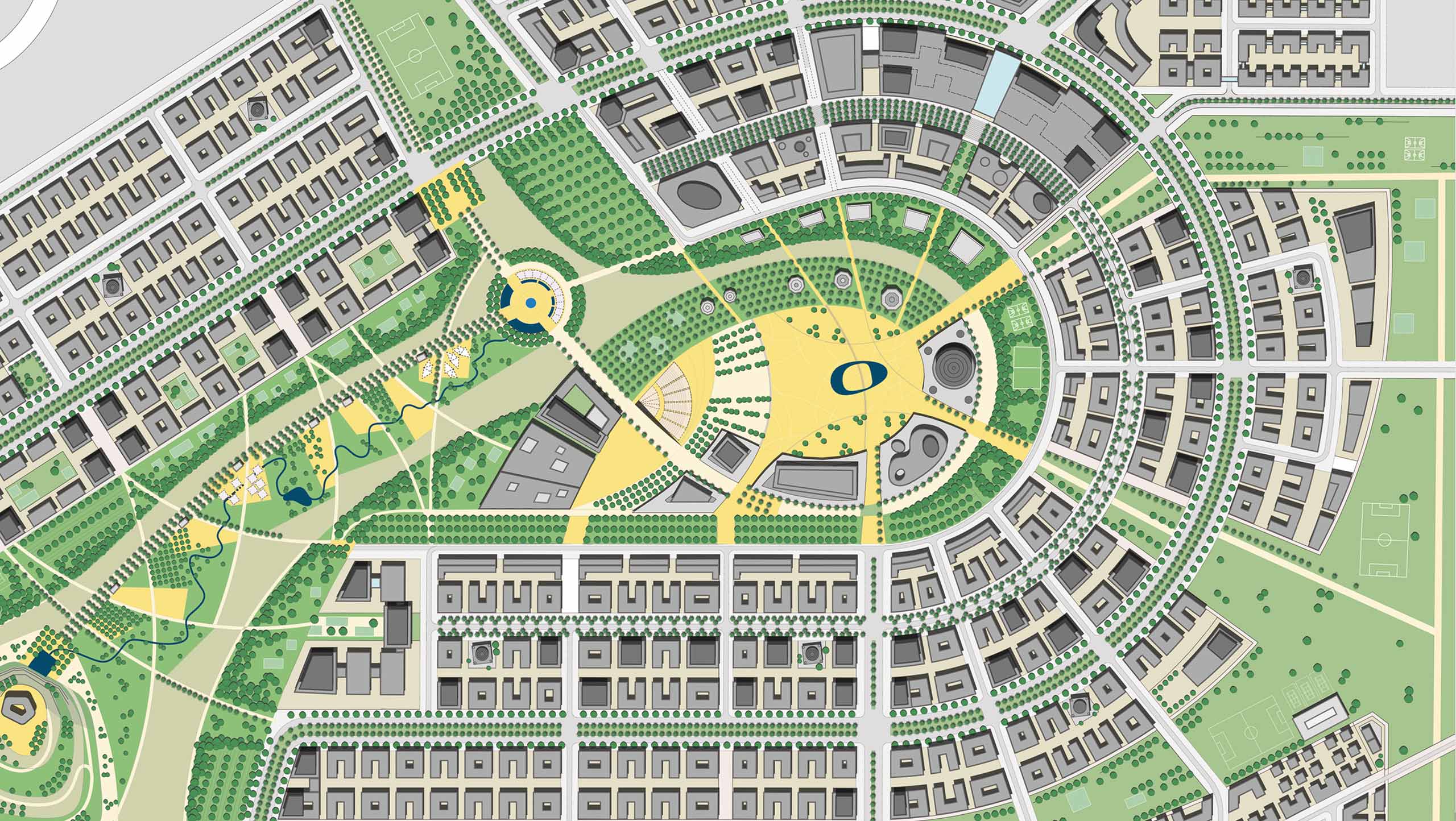
A city infographic template is a pre-planned visual layout designed around urban subjects. Instead of beginning with a blank page, the creator starts with an organized structure containing areas for information. These areas may include a central city illustration, statistics, road networks, landmarks, callout boxes, charts, icons, timelines, or demographic summaries.
The main advantage of this approach is visual consistency. A city contains many connected systems, so a successful infographic should help viewers understand relationships rather than presenting isolated facts. For example, transportation information can be connected to employment areas, residential districts, public facilities, and population density.
A strong template does not force every project into the same visual style. Instead, it provides a flexible framework. You can change colors, replace icons, reorganize sections, simplify charts, or emphasize the information that matters most to your audience.

Why Urban Infographics Are Useful
Urban subjects often involve several layers of information. A single city report might discuss housing, mobility, education, public health, green spaces, local business, infrastructure, and future development. Without visual organization, readers may struggle to identify the most important message.
An infographic can create hierarchy by showing the main idea first and supporting details second. The viewer should immediately understand what the visual is about before examining smaller labels and statistics.
- Faster communication: Key information can be understood through visual grouping.
- Improved comparison: Charts and icons make differences between districts or categories easier to recognize.
- Stronger storytelling: Maps and timelines can explain how locations or conditions relate to each other.
- Better presentation quality: Consistent visual elements make reports and slides appear more organized.
- Flexible reuse: A well-built layout can support multiple city-related topics.
The most effective design is not necessarily the most decorative. Its purpose is to guide attention toward useful information.

Choosing the Right City Infographic Template
Before selecting a design, identify the main communication goal. A tourism infographic has different requirements from a transportation analysis, while a school geography project requires a different level of detail from an investor presentation.
Start With the Main Question
Ask what the audience should understand after viewing the infographic. The answer should influence the entire layout. For example:
- How is the city growing?
- Which transportation routes connect important districts?
- Where are major public services located?
- What makes the city attractive to visitors?
- How are environmental initiatives changing urban life?
- Which demographic patterns should be compared?
When the central question is clear, unnecessary decorative elements become easier to remove.
Choose a Suitable Information Density
Beginners often make one of two mistakes: they either leave too much empty space or attempt to place every available fact on one page. The ideal density depends on the viewing environment.
A presentation slide should normally focus on a small number of key messages because viewers need time to follow the speaker. A report infographic can contain more detail because readers can study it at their own pace. A classroom visual may benefit from larger icons and simpler labels.

Using Different File Formats and Platforms
The format you choose affects how much control you have over the design. The phrases city infographic template png, city infographic template powerpoint, and city infographic template pdf represent different practical needs.
PNG for Finished Visuals
A city infographic template png is useful when the design is intended to remain visually fixed. This format works well for blog illustrations, reports, social graphics, posters, and documents where the layout does not require further editing. Before exporting a final image, check text size carefully because small labels may become difficult to read after resizing.
Presentation-Based Layouts
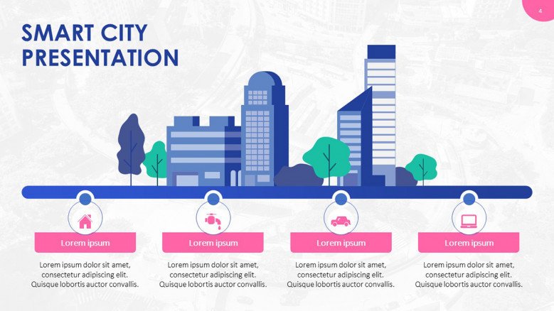
A city infographic template powerpoint or city infographic ppt is particularly useful for meetings, lectures, proposals, and workshops. Editable presentation elements make it easier to adjust text, colors, shapes, charts, and icon placement for different audiences.
When working with presentation slides, maintain a clear focal point. A central map or skyline can support the theme, while surrounding callouts explain the most important data.
Online Collaboration
A city infographic template google slides can be useful when multiple contributors need to review or edit the same presentation. Shared editing works especially well for student projects, planning workshops, and team presentations. Establish basic rules for fonts, colors, icon styles, and spacing before several contributors begin editing.
City Infographic Template Canva and Word Workflows
The phrase city infographic template canva often refers to projects that require quick visual customization without advanced design software. This type of workflow is useful for tourism materials, classroom assignments, social content, local events, and basic business communication.
For document-centered work, a city infographic template word can support reports, worksheets, proposals, and educational handouts. Word-based layouts generally work best when the infographic contains a moderate amount of information and needs to appear alongside longer written content.
Regardless of platform, avoid changing every design element. Begin with the existing visual structure and modify only what improves the communication. Changing colors, fonts, shapes, and spacing without a clear reason can make a previously balanced template look inconsistent.
City Infographic Templates to Customize Effectively
Successful city infographic templates to customize should provide flexibility without losing structure. Customization is more than replacing placeholder text. It should connect the visual to the subject and audience.
Customize the Color System
Use color to organize meaning. For example, transportation may use one color family, green infrastructure another, and public services another. Avoid assigning random colors simply because they look attractive individually.
A limited palette usually improves readability. Choose a primary color, one or two supporting colors, and neutral tones for background elements. Important data should have stronger contrast than decorative details.
Replace Generic Icons With Relevant Symbols
Icons should clarify the subject. A bus icon can represent mobility, a tree can represent green infrastructure, and a school building can represent education. However, too many unrelated icon styles can make the infographic feel assembled from different projects.
Adapt the Typography
Typography should create hierarchy. A viewer should first notice the title, then major statistics or categories, followed by supporting explanations. Use fewer font styles and maintain consistent heading sizes.
Building a City Infographic Step by Step
Creating an effective urban infographic becomes easier when the process is divided into stages.
1. Define the Core Message
Write one sentence describing the main point of the infographic. If the sentence is unclear, the design will probably become unclear as well.
2. Select the Essential Data
Choose only information that supports the main message. Supporting information should explain, compare, or provide context for the central idea.
3. Choose a Visual Structure
Common structures include central city illustrations, map-based layouts, vertical timelines, comparison panels, roadmaps, district summaries, and connected callout diagrams.
4. Create a Reading Path
Guide the viewer from one section to another. Numbered points, directional lines, grouped panels, and carefully positioned headings can create a natural sequence.
5. Review at Smaller Sizes
An infographic may look clear on a large monitor but become difficult to understand on a smaller screen. Test the design at the approximate size where the audience will actually view it.
6. Remove Anything That Does Not Help
Before finalizing the design, review every chart, icon, label, and illustration. If an element does not support the message, consider removing it.

Practical Applications for Education
A city infographic template for education can make geography, history, economics, environmental studies, and urban planning easier to explain. Students often understand complex systems more easily when they can see relationships between places, people, infrastructure, and resources.
For example, a geography lesson can use a city map with sections for rivers, roads, parks, commercial districts, and residential areas. A history project can use a timeline showing the development of important landmarks. An environmental lesson can compare transportation, green space, energy use, and waste systems.
Teachers should prioritize clarity over decorative complexity. Large labels, recognizable icons, and carefully selected statistics are usually more useful than a highly detailed design with tiny text.
Design Ideas for Business and Professional Presentations
Urban visuals can also support real estate proposals, infrastructure planning, tourism strategies, market analysis, public communication, and corporate presentations. The phrase city design templates free is often associated with people seeking accessible visual starting points, but the most important selection criterion should still be suitability for the project.
For professional work, consider how the infographic will be viewed. A large conference screen requires different typography and spacing from a printed report. If a presentation will be discussed verbally, use the infographic to support the explanation rather than attempting to make it contain the entire report.
Brand consistency also matters. Adapt the palette and typography so the city visual fits the wider presentation while preserving enough contrast for maps and data.
Common Mistakes to Avoid
Even a visually attractive city infographic can fail if the information is poorly organized.
- Using too many chart types: Visual variety is useful only when each format serves a clear purpose.
- Overloading the map: Too many labels can hide the geographic relationships the map is meant to explain.
- Ignoring contrast: Light text on a busy illustration can become difficult to read.
- Mixing icon styles: Combining detailed illustrations with simple line icons can create inconsistency.
- Using decorative data: Every statistic should support the central message.
- Repeating the same message: If a chart and paragraph communicate identical information, consider simplifying one of them.
Advanced Tips for More Effective Urban Data Storytelling
Experienced designers can improve a city infographic by thinking beyond individual elements and focusing on relationships. Urban information is often connected spatially, temporally, or functionally.
A spatial relationship explains where something happens. A temporal relationship explains when it happens. A functional relationship explains how one system influences another. An advanced infographic can combine these perspectives without overwhelming the viewer.
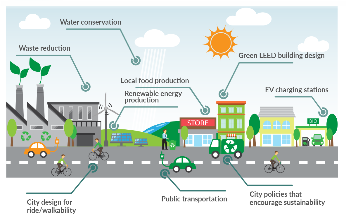
For example, a smart-city visual might place the city at the center, show connected infrastructure systems around it, and use a second level of information for specific outcomes. This structure allows the audience to understand the overall ecosystem before examining individual details.
Use repetition deliberately. Repeated shapes can create consistency, while repeated colors can identify categories across different sections. The goal is to build a visual language that viewers learn while reading the infographic.
How to Match the Template to Your Audience
Audience expectations should influence the final design. A city council audience may want detailed categories and carefully labeled comparisons. A tourist audience may prefer landmarks, routes, attractions, and visual orientation. Students may benefit from simpler explanations and larger graphics.
Consider three questions before finalizing the design:
- What does the audience already know?
- What is the most important new information?
- What action or understanding should result from viewing the infographic?
These questions help prevent a common design problem: creating a visually impressive page that does not clearly communicate a purpose.
FAQ About City Infographic Template Designs
What should a city infographic include?
The content depends on the topic, but useful elements may include maps, landmarks, transportation, demographic comparisons, infrastructure, environmental features, timelines, and concise explanations. Only include elements that support the main message.
Is a map always necessary?
No. A city skyline, connected diagram, timeline, statistical layout, or district comparison can also communicate urban information effectively. Use a map when location is important to the story.
How many colors should I use?
A small, consistent palette is usually easier to understand. Use additional colors only when they represent meaningful categories or improve visual hierarchy.
Can one template be used for different cities?
Yes. A flexible layout can be adapted by replacing the map, skyline, landmarks, labels, statistics, and color system while preserving the overall structure.
How can I make an infographic easier to read?
Create a clear hierarchy, reduce unnecessary text, increase contrast, use consistent spacing, and test the design at the size your audience will actually see.
Final Recommendations
A strong city infographic template should do more than decorate urban information. It should organize complexity, establish priorities, and help the audience understand how facts, places, systems, and trends connect. Start with a clear question, choose a structure that supports the answer, and customize only the elements that improve communication. Whether you are preparing a classroom visual, business presentation, planning concept, tourism guide, or urban report, the best result comes from balancing visual appeal with clarity, relevance, and a well-defined story.