A minimal tech logo is more than a simplified symbol. It is a visual system designed to communicate innovation, clarity, intelligence, and trust with as few unnecessary elements as possible. For technology companies, software startups, AI platforms, SaaS products, cybersecurity businesses, and digital agencies, a clean logo can help create a recognizable identity across websites, applications, social media, product interfaces, presentations, and printed materials.
The strongest technology logos often appear simple because every shape has a purpose. A line may suggest connectivity, a circle may represent a network, negative space may create a hidden symbol, and a carefully chosen typeface may make a brand feel either approachable or highly technical. This guide explains how to develop a memorable minimal tech logo, evaluate different visual directions, choose colors and typography, create scalable assets, and turn a simple concept into a complete brand identity.

What Defines a Minimal Tech Logo?
A technology logo becomes minimal when its visual language is reduced to the elements that are genuinely necessary for recognition. Instead of combining multiple icons, effects, textures, and decorative details, the design focuses on one clear idea. This could be a geometric mark, a monogram, an abstract symbol, a custom letterform, or a simple combination of an icon and wordmark.
A successful minimalist tech logo usually has four qualities: clarity, memorability, flexibility, and relevance. The logo should remain recognizable at a small size, work on light and dark backgrounds, and still communicate something appropriate about the company’s personality.
Minimalism does not mean that every technology brand should use the same circle, hexagon, or circuit line. The goal is not to remove personality. The goal is to remove visual noise. A distinctive concept can still feel expressive while using a limited number of shapes.
Why Simplicity Works for Technology Brands
Technology products often appear in many environments. A logo may be displayed as a browser icon, mobile application icon, profile image, dashboard mark, presentation symbol, product label, or website header. A complicated design can lose important details when reduced. A simpler mark usually adapts more easily.

This is one reason why a strong minimal tech logo design begins with structure rather than decoration. Designers should first establish a recognizable silhouette and only then consider additional details.
Key Visual Elements of Minimal Technology Branding
The best technology branding systems often combine a small number of visual principles consistently. Understanding these principles makes it easier to evaluate concepts and avoid creating something that looks fashionable but lacks long-term usefulness.
Geometric Shapes
Geometry is common in technology branding because it can communicate precision, systems, logic, movement, and engineering. Circles can suggest connection and continuity. Squares can feel stable and structured. Triangles can imply direction and progress. Hexagons can suggest networks or modular systems.
The important decision is not which shape is most modern. It is whether the shape supports the brand concept. For example, a cybersecurity company may benefit from a structured protective form, while an AI platform may use connected geometry that suggests relationships and intelligent systems.
Negative Space
Negative space is the area around and inside a logo’s visible shapes. In minimal branding, negative space can become an active design element. A hidden letter, directional arrow, opening, or secondary symbol can add depth without increasing visual clutter.

Advanced designers often test negative space by viewing the logo in a single color. If the concept remains clear without gradients or shadows, the underlying construction is usually stronger.
Controlled Color
Technology brands frequently use blue, purple, teal, black, white, and subtle gradients, but color should support the concept rather than replace it. A logo that only looks interesting because of a gradient may become weak when displayed in one color.

Start with a monochrome version. Then introduce a restrained color system. This approach ensures the identity remains recognizable when used in different environments.
Minimal Tech Logo Ideas for Different Industries
One of the most useful ways to develop minimal tech logo ideas is to begin with the business model and the problem the company solves. The symbol should connect to a brand idea rather than simply repeat common technology imagery.
AI and Machine Learning
AI brands can explore connected nodes, abstract intelligence, neural relationships, modular geometry, directional movement, or custom letterforms. Avoid relying entirely on literal brain illustrations unless they genuinely support the positioning.

SaaS and Software Platforms
Software companies often benefit from symbols that suggest systems, layers, flow, organization, or transformation. A logo can use overlapping forms, modular elements, or a distinctive lettermark to create an identity that feels efficient and scalable.

Cybersecurity
Security brands should balance protection with modernity. Shields, locks, fingerprints, and networks can become overly familiar when copied literally. A stronger approach is to simplify the idea of protection into a distinctive geometric structure.

For example, a logo could combine a shield silhouette with circuit lines while maintaining enough simplicity to work as an application icon.
Data and Analytics
Data brands can explore stacked layers, connected structures, directional systems, modular patterns, or simplified network forms. The visual concept should communicate organization and insight rather than random complexity.
How to Create a Minimal Tech Logo Design Step by Step
Creating a strong logo becomes easier when the process moves from strategy to visual execution. Starting with effects or decoration often produces concepts that look impressive temporarily but lack a clear foundation.
1. Define the Brand Personality
Write down the qualities the company should communicate. Examples include intelligent, reliable, bold, calm, precise, human, futuristic, secure, energetic, or premium. Choose a small group of traits rather than trying to represent everything.
2. Identify One Core Concept
A memorable logo generally needs one central visual idea. A cloud platform might focus on connection. A fintech company might focus on flow. A software platform might focus on layers. An AI company might focus on transformation.

Once the concept is clear, explore several visual interpretations rather than refining the first idea immediately.
3. Sketch Multiple Directions
Create simple black-and-white concepts. Test symbols, monograms, abstract forms, and wordmarks. At this stage, speed matters more than polish. The goal is to discover which visual direction has the strongest potential.

4. Build a Strong Silhouette
Reduce the selected concept until its outline is recognizable. A logo should not depend on tiny details for identification. If the silhouette becomes generic after simplification, the concept needs further development.
5. Test Typography
Typography strongly influences whether a technology brand feels corporate, experimental, approachable, or futuristic. Sans-serif typefaces are common, but common does not mean identical. Letter spacing, weight, proportions, and custom modifications can create distinction.
6. Test Real Applications
Place the concept in realistic contexts such as an application icon, website header, presentation cover, dark interface, and social profile image. This reveals weaknesses that may not be visible on a plain artboard.
Minimal Tech Logo PNG and Other Practical File Formats
When preparing final brand assets, a minimal tech logo png can be useful for presentations, websites, social posts, and interface previews because it can support transparent backgrounds. However, raster files are only one part of a complete logo package.

A complete identity should also include scalable artwork for situations where the logo needs to appear at very different sizes. This is where a minimal tech logo vector becomes important. Vector artwork is built from mathematical paths, allowing the mark to remain sharp when enlarged.
Useful Asset Variations
- Primary logo: the main version used across core brand materials.
- Icon mark: a simplified symbol for compact spaces.
- Horizontal version: useful for headers and navigation.
- Monochrome version: suitable for single-color applications.
- Light and dark versions: designed for different backgrounds.
- Small-size version: adjusted for very compact interfaces.
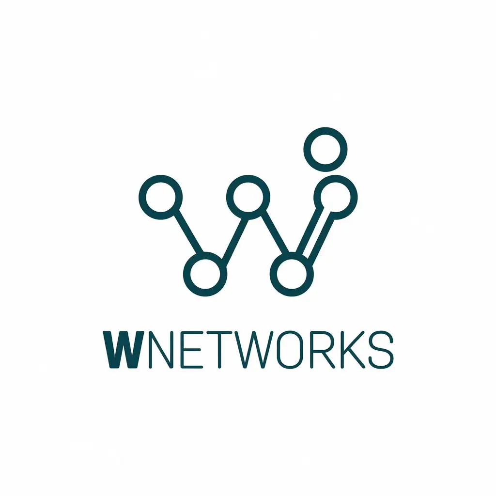
Using a Minimal Tech Logo Maker Effectively
A minimal tech logo maker can be useful for rapid concept exploration, especially when a founder needs to compare directions before investing in a more complete brand system. However, generated concepts should be evaluated carefully.
The most useful workflow is to treat automated concepts as starting points rather than finished identities. Review whether the symbol is distinctive, whether it communicates the right personality, and whether it resembles common industry patterns too closely.

Before choosing a concept, test it in monochrome, at small sizes, and beside competitor branding. If it disappears into the visual language of the category, refine the idea further.
Minimal Tech Logo Inspiration Without Copying Existing Brands
Searching for minimal tech logo inspiration can be helpful, but inspiration should be used to understand principles rather than copy visible elements. Study how successful marks use spacing, contrast, geometry, typography, and negative space.

When reviewing minimal tech logos for inspiration, ask practical questions:
- What is the single idea behind the symbol?
- Would the logo remain recognizable in one color?
- Does the silhouette feel distinctive?
- Can the mark work as a small application icon?
- Is the typography doing too much or supporting the symbol?
- Would the design still feel appropriate if the brand expanded?
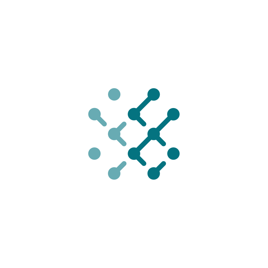
This approach produces stronger research than simply collecting screenshots. The purpose is to identify transferable design principles.
How Minimal Tech Logos Support Business Growth
Strong minimal tech logos for business can create consistency across many customer touchpoints. A recognizable identity can make a startup appear more organized and intentional, especially when the same visual system is applied consistently.
The logo itself is only one part of the system. A complete technology identity should consider typography, spacing, interface colors, icon style, illustration direction, and photography choices. When these elements work together, the brand feels coherent.
Scalability Is a Business Advantage
A small startup may initially use its logo on a website and social profile. As the company grows, the same identity may appear in product interfaces, investor materials, conferences, merchandise, documentation, and partnerships. A simple, well-constructed mark is easier to adapt.

Common Mistakes in Minimalist Tech Logo Design
Minimalism can create its own problems when simplicity is mistaken for lack of originality. Removing detail does not automatically create a strong identity.
Using Generic Symbols Without a New Idea
A circuit, cloud, shield, or hexagon is not automatically distinctive. If a symbol could belong to hundreds of competitors, it needs a stronger concept, unusual proportion, custom construction, or meaningful combination.
Adding Technology Details Everywhere
Too many nodes, lines, gradients, glows, and futuristic effects can make a logo less flexible. The viewer should understand the overall form before noticing secondary details.
Ignoring Small Sizes
A logo may look excellent on a large presentation screen and become unreadable inside a small interface. Always test the mark at realistic sizes.

Following Trends Too Literally
Trends can provide useful context, but a company identity should not depend entirely on a short-lived visual style. A minimal logo should have a reason for every major design decision.
Choosing Between Abstract Symbols, Monograms, and Wordmarks
There is no single correct structure for every technology company. The right choice depends on the company name, market position, and intended applications.
Abstract Symbols
Abstract symbols are useful when a company wants to represent an idea such as movement, intelligence, connection, or transformation without showing a literal object. They can become powerful visual assets when the construction is distinctive.
Monograms
Monograms use one or more letters as the basis for the mark. They can work particularly well for short company names and digital products where compact recognition is important.
Wordmarks
A wordmark relies primarily on custom typography. This can be effective when the company name is distinctive and the lettering can create recognition without a separate icon.
Minimal Tech Logo Images and Visual Research
When collecting minimal tech logo images, organize references by design principle rather than simply saving everything that looks attractive. Create groups for geometry, monograms, network concepts, typography, color systems, application icons, and brand layouts.

The same approach applies to minimalist tech logo images. A useful reference collection should help answer design questions. For example, one image might demonstrate strong negative space while another demonstrates effective small-scale icon construction.
This makes visual research more actionable. Instead of asking which design to imitate, ask which principle can help solve a specific branding problem.
Advanced Tips for Creating a More Distinctive Logo
Experienced designers can improve originality by focusing on relationships between elements rather than individual shapes. A circle alone is common. A custom relationship between a circle, line, angle, and negative space can become distinctive.
Create a Construction System
Use a consistent grid, angle family, corner radius, or proportional relationship. This gives the logo an internal logic that can later extend into icons, patterns, and interface elements.

Build a Recognizable Motion Direction
Even static logos can suggest movement. Upward angles may imply growth. Interlocking forms can imply collaboration. Repeated modules can suggest scale. The direction should support the company’s positioning.
Design for Contrast First
Before refining color, ensure that the logo has enough contrast in black and white. This helps reveal whether recognition depends on shape or surface treatment.
FAQ About Minimal Tech Logo Design
What makes a minimal tech logo memorable?
A memorable mark has a clear concept, distinctive silhouette, balanced proportions, and enough simplicity to remain recognizable in small spaces. Memorability comes from a strong visual decision, not from adding more details.
Are minimalist tech logos suitable for startups?
Yes. Minimalist tech logos can work especially well for startups because they adapt easily across websites, applications, product interfaces, and presentations. The design should still be distinctive enough to avoid looking interchangeable with competitors.

Should a technology logo use blue?
Blue is common because it can suggest reliability and technology, but it is not required. The best color depends on the brand personality, competitive landscape, and visual positioning.
Is a symbol or wordmark better for a technology company?
Both can work. A symbol is useful for compact recognition, while a wordmark can make a distinctive company name more memorable. Many brands eventually use a flexible system containing both.
How can I make a minimal logo look less generic?
Focus on a specific brand idea, create custom proportions, use meaningful negative space, and avoid combining common technology symbols without modification. Distinctiveness often comes from relationships between simple elements.

Final Recommendations for a Minimal Tech Logo
A strong minimal tech logo should be simple enough to work everywhere but distinctive enough to belong unmistakably to one brand. Begin with strategy, identify one meaningful concept, explore multiple directions, test the silhouette in monochrome, and evaluate the result in realistic applications. Use research carefully, whether you are studying minimalist tech logo images, reviewing a minimal tech logo vector, or comparing concepts generated with a minimal tech logo maker.
The most effective technology identity is rarely the one with the most visual effects. It is the one with the clearest idea, strongest structure, and most consistent application. When simplicity is guided by strategy rather than decoration, a minimal technology logo can remain recognizable, flexible, and relevant as the business evolves.