A well-designed Cyber Monday Banner can instantly communicate your biggest online shopping deals and encourage visitors to explore your store. During one of the busiest online shopping periods of the year, customers are exposed to countless promotions. A clear, attractive, and strategically designed banner can help your offer stand out while making important information easy to understand.
Whether you are promoting electronics, fashion, digital products, home goods, or special online discounts, a Cyber Monday banner gives your website, landing page, email campaign, or social media profile a strong promotional focal point. The right combination of typography, colors, promotional messaging, product imagery, and calls to action can turn a simple graphic into a useful marketing asset.
This guide explains how to create an effective Cyber Monday banner, what information to include, which design elements matter most, and how to optimize your banner for different digital platforms.
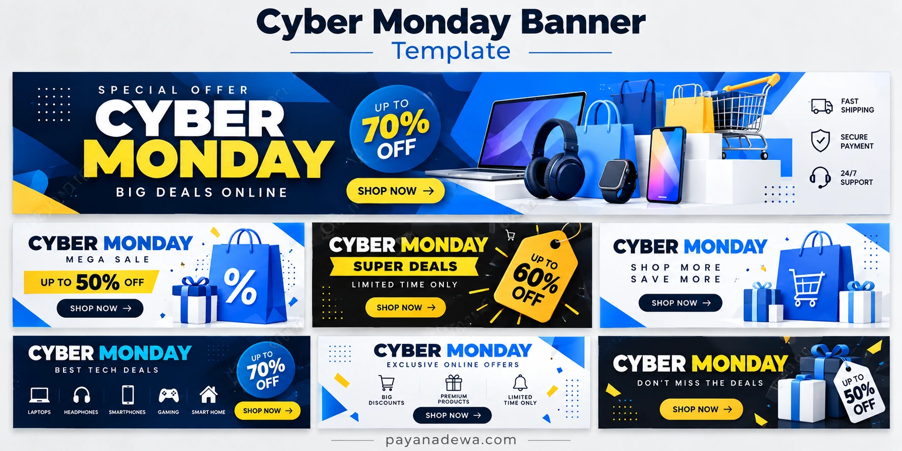
What Is a Cyber Monday Banner?
A Cyber Monday banner is a promotional graphic created specifically for Cyber Monday sales. It can appear at the top of an ecommerce website, inside an online store, across social media platforms, in newsletters, or on digital advertising campaigns.
The primary purpose is to communicate an offer quickly. Visitors should understand what is being promoted without having to read a large amount of text. Effective banners usually combine a strong headline with a discount, supporting message, and clear call to action.
Common Elements of a Cyber Monday Banner
- Cyber Monday headline: Clearly identifies the shopping event.
- Discount message: Highlights the main promotional benefit.
- Product imagery: Shows customers what they can purchase.
- Call-to-action button: Encourages visitors to shop or learn more.
- Limited-time messaging: Creates awareness of the promotional period.
- Brand identity: Uses recognizable colors, fonts, and visual elements.
Why a Cyber Monday Banner Matters for Online Stores
Cyber Monday is strongly associated with online shopping, making visual communication particularly important. Customers often compare multiple stores and offers at the same time. A prominent promotional banner helps establish the purpose of a landing page immediately.
A professionally designed banner can also create visual consistency across your marketing campaign. When your website, email newsletter, social media posts, and advertisements use similar promotional graphics, customers can more easily recognize the campaign.
However, an attractive design should always support usability. The banner should not overwhelm visitors with too many messages or decorative elements. The most important offer should remain easy to identify.
How to Design an Effective Cyber Monday Banner
1. Start With a Strong Headline
The headline should immediately tell visitors why the banner exists. Phrases such as Cyber Monday Sale, Cyber Monday Deals, or Cyber Monday Special Offer are straightforward and easy to understand.
Keep the main headline visually prominent. Customers should be able to recognize the campaign even when they only glance at the banner for a few seconds.
2. Highlight Your Main Offer
If your store has a major discount, make it visually noticeable. For example, you might highlight a percentage discount, a special bundle, free shipping, or another clearly defined promotion.
Avoid presenting too many competing offers in the same visual area. If everything is emphasized, nothing feels important. Choose the primary offer and make it the visual focus.
3. Use a Clear Call to Action
A Shop Now button is a common choice for ecommerce campaigns. Other options include View Deals, Explore Offers, or Get the Deal.
The call to action should be easy to find and should communicate what happens when the customer clicks it. This is particularly important for banners displayed above the fold.
4. Choose a Strong Color Combination
Cyber Monday graphics often use dark backgrounds combined with bright promotional colors. Navy, black, blue, white, and yellow can create a modern ecommerce appearance while providing strong contrast.
Your brand colors can also be incorporated into the design. The goal is not simply to make the banner colorful. Instead, use color to establish hierarchy and direct attention toward the headline, offer, and call-to-action button.
Cyber Monday Banner Ideas for Different Businesses
A banner does not have to look identical for every type of business. The visual style should reflect the products and audience being targeted.
Electronics and Technology Stores
Technology retailers can feature laptops, smartphones, headphones, gaming accessories, smart home products, or other popular devices. A dark modern layout can work particularly well with technology-focused promotions.
Fashion Stores
Fashion brands can use product photography, seasonal colors, and minimalist typography. Instead of placing too much information on the banner, focus on the collection, discount, and shopping action.
Digital Product Businesses
Software companies, template stores, online courses, and digital product sellers can use a banner to promote limited-time pricing, bundles, memberships, or special packages.
General Ecommerce Stores
Stores with multiple product categories can use shopping bags, gift boxes, discount tags, carts, or product collections to communicate a broad Cyber Monday promotion.
Where to Use a Cyber Monday Banner
One promotional design can often be adapted for multiple marketing channels. However, each platform has different dimensions and user behavior, so the layout may need to be adjusted.
- Website homepage: Use a large banner to introduce the main campaign.
- Landing pages: Focus the design around a specific promotion.
- Email newsletters: Use a compact design that works well on mobile devices.
- Social media: Create platform-specific versions with readable text.
- Online advertisements: Keep the message concise and visually prominent.
- Store category pages: Promote discounts relevant to specific product categories.
Cyber Monday Banner Design Tips for Better Readability
Readability is one of the most important aspects of promotional graphic design. A banner can look impressive while still being difficult to understand. Avoid overly complicated layouts, excessive text, and decorative elements that compete with the primary message.
Use a clear visual hierarchy. The campaign name should generally be easy to identify, followed by the main offer and supporting information. The call-to-action should remain visually distinct.
Keep Text Short
Customers should not need to read a paragraph to understand a banner. Short phrases are usually more effective for promotional graphics. For example, a banner could communicate the event, discount, and action with only a few words.
Make Mobile Users a Priority
Many customers will see Cyber Monday promotions on smartphones. Small text that looks acceptable on a desktop monitor can become difficult to read on a mobile screen.
Before publishing your banner, check it at different screen sizes. Make sure the headline, discount, and call-to-action remain visible without excessive zooming.
How to Optimize a Cyber Monday Banner for SEO
Although an image itself does not replace useful written content, optimizing the surrounding page can help search engines understand the topic. Use a descriptive image filename, relevant alternative text, and supporting content that naturally discusses Cyber Monday promotions.
The primary keyword should be used naturally in the page title, heading, image alt text, and relevant sections. Avoid repeating the exact keyword excessively because readability should remain the priority.
For example, a descriptive image filename such as cyber-monday-banner-template.webp is more informative than a generic filename generated by an image editor.
What Makes a Cyber Monday Banner Effective?
An effective banner combines visual appeal with practical communication. The design should attract attention, but the customer should also understand the offer quickly.
- Use one primary promotional message.
- Make the Cyber Monday headline prominent.
- Highlight the most important discount or benefit.
- Use high-contrast typography.
- Include a recognizable call to action.
- Maintain consistent branding.
- Optimize the design for mobile screens.
- Use compressed image files for faster page loading.
- Keep supporting text concise.
- Test different designs when possible.
Common Cyber Monday Banner Mistakes to Avoid
Some promotional banners fail because they attempt to communicate too much information at once. A crowded design can make the customer unsure about what action to take.
Another common issue is weak contrast. Text should remain readable against its background, especially when the banner includes product photography or complex graphics.
It is also important to avoid misleading promotional information. If a banner advertises a discount, shipping benefit, or limited-time offer, the corresponding terms should be accurate and available on the destination page.
How to Use a Cyber Monday Banner Template
A Cyber Monday Banner Template can save time by providing an established visual structure. Instead of creating every element from scratch, you can customize the headline, discount, product imagery, colors, branding, and call-to-action.
Templates are especially useful when you need several variations for different channels. For example, you can create a wide website banner, a social media graphic, and a compact email version while maintaining the same visual identity.
Customize Before Publishing
Always replace generic promotional information with details that accurately represent your campaign. Check the discount percentage, dates, product names, button text, and brand information before publishing.
A template should provide a starting point rather than prevent customization. Adjust the design to match your brand and the expectations of your target audience.
Final Tips for Your Cyber Monday Campaign
Start preparing your promotional graphics before the campaign begins. This gives you enough time to review the design, create different dimensions, test the landing page, and check how the banner appears on desktop and mobile devices.
Keep your campaign consistent across every customer touchpoint. The same core message, colors, and visual identity can make your Cyber Monday promotion easier to recognize.
Most importantly, make the customer benefit obvious. A strong Cyber Monday Banner should answer three basic questions quickly: what is being offered, why should the customer care, and what should they do next?
Conclusion
A thoughtfully designed Cyber Monday Banner can become an important part of an online sales campaign. By combining a clear headline, compelling offer, strong visual hierarchy, readable typography, relevant imagery, and an effective call to action, businesses can create promotional graphics that communicate quickly and professionally.
Whether you are building a website homepage, ecommerce landing page, email campaign, or social media promotion, a reusable Cyber Monday banner template can make the design process faster and more consistent. Focus on clarity, mobile readability, accurate promotional information, and a strong customer-focused message to create a banner that supports your seasonal marketing campaign.