A Minimalistic Presentation Template is designed to make ideas easier to understand by removing unnecessary visual noise. Instead of filling every slide with text, decorative effects, charts, and competing colors, a minimalist approach gives the most important information room to stand out. This makes the presentation feel organized, professional, and intentional.
Whether you are preparing a business proposal, investor pitch, marketing strategy, academic project, portfolio, or internal report, the right slide system can improve how your audience follows your message. In this guide, you will learn what makes minimalist presentation templates effective, how to choose the right layout, how to customize slides for different purposes, and how to avoid common design mistakes.
What Makes a Minimalistic Presentation Template Effective?
A minimalist presentation is not simply a presentation with fewer objects. Effective minimalism is based on purposeful reduction. Every title, image, icon, number, and visual element should support the main message of the slide.
The strongest minimalist presentation templates usually combine generous spacing, clear typography, limited colors, consistent alignment, and a strong visual hierarchy. The audience should quickly understand what to look at first, what supports the main point, and what action or conclusion follows.
One main idea per slide
A common presentation problem is trying to communicate several major ideas on one slide. Minimal design encourages you to separate complex topics into smaller, easier-to-follow moments. A slide about market growth should focus on market growth. A slide about customer behavior should focus on customer behavior.
This does not mean every slide must contain only one sentence. Supporting details are useful when they strengthen the central message. The key is hierarchy: one dominant idea should guide the viewer.

White space creates emphasis
Empty areas are often treated as wasted space, but in minimalist design they are part of the communication system. Space separates ideas, improves readability, and prevents unrelated elements from visually competing.
When selecting a template, look at the margins around headings, charts, images, and body text. If every section is crowded, the design may look busy even when it uses only a few colors.
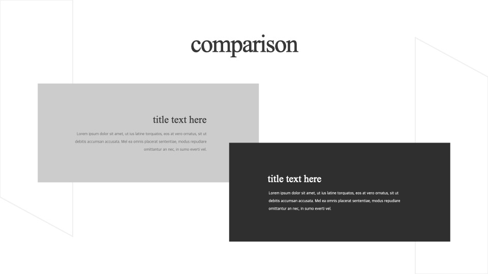
Key Components of a Strong Minimalistic Presentation Template
A polished presentation system usually contains more than an attractive cover slide. It needs a consistent set of layouts that can support the complete story.
- Title slides that establish the subject and visual tone.
- Agenda slides that help audiences understand the structure.
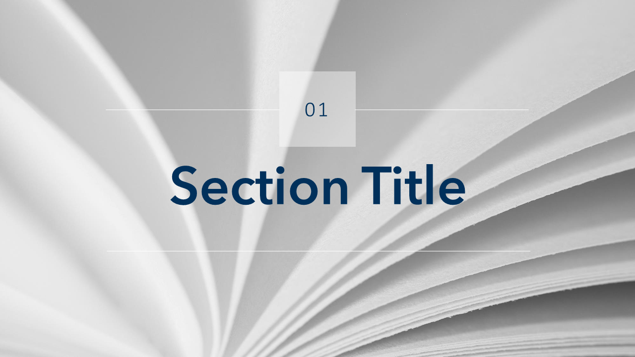
- Section dividers that signal a transition between topics.
- Content slides for explaining concepts clearly.
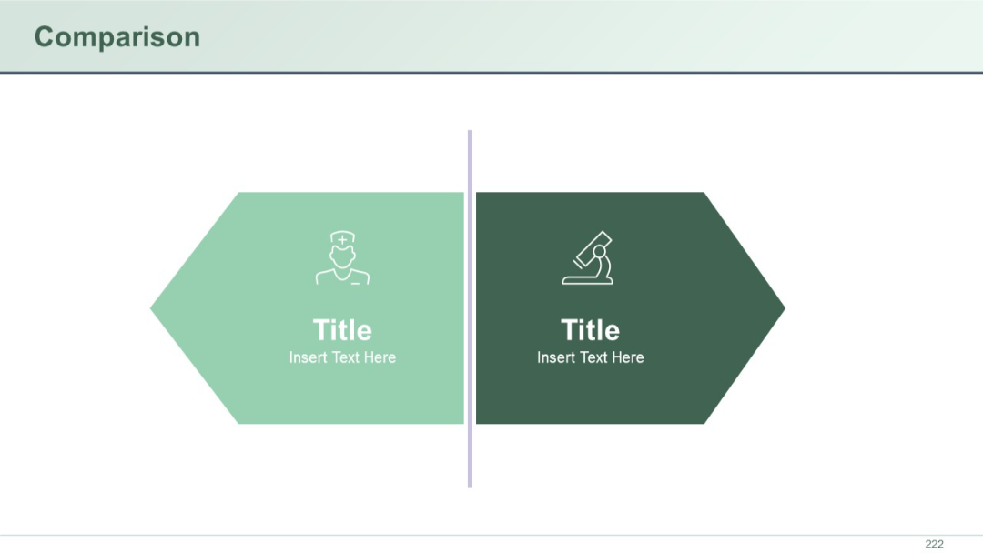
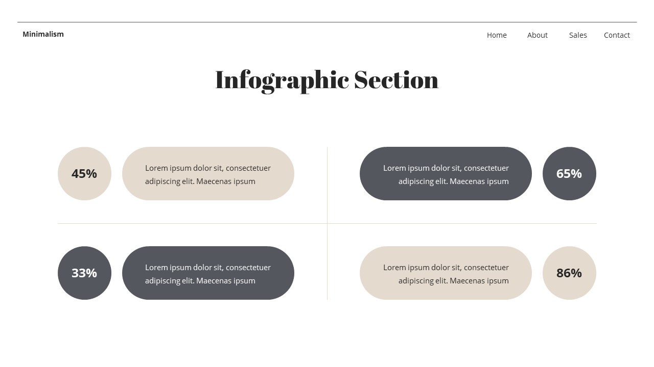
- Data layouts for charts, metrics, and comparisons.
- Timeline slides for showing progress and milestones.
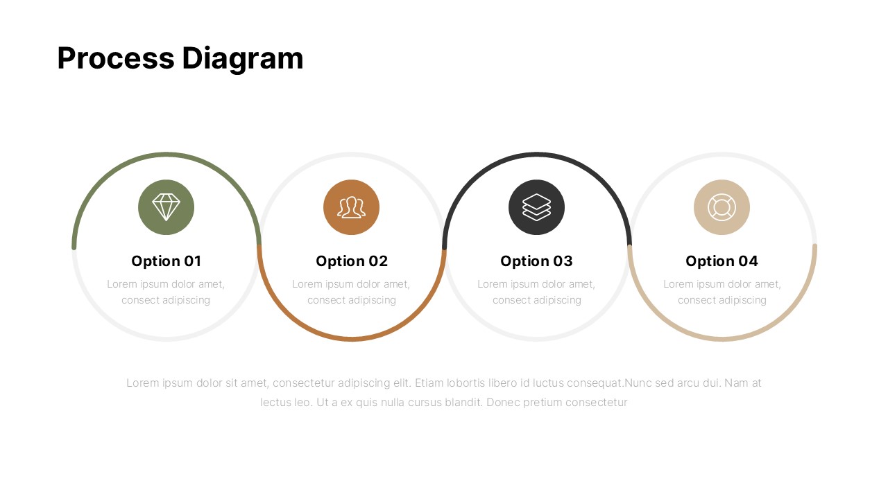
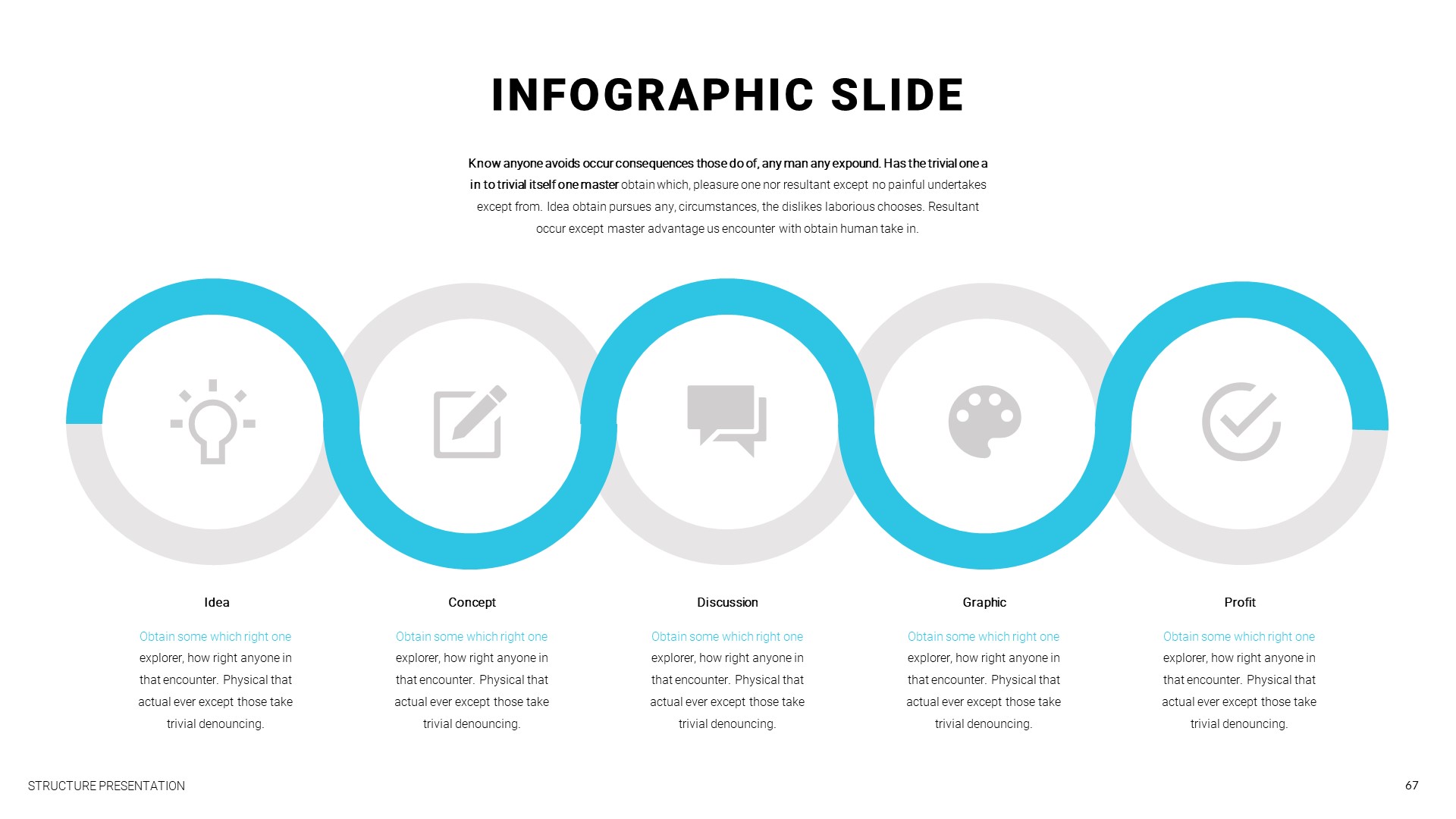
- Process diagrams for explaining workflows.
- Closing slides that provide a clear final message or next step.
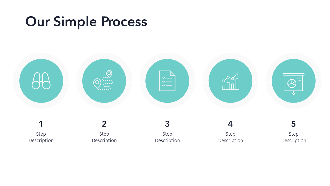
The best template is not necessarily the one with the largest number of decorative layouts. It is the one that gives you a reliable structure for the type of story you need to tell.
Minimalistic Presentation Template Google Slides and Online Collaboration
A minimalistic presentation template google slides can be useful when several people need to contribute to the same deck. Minimal design systems work especially well in collaborative environments because the visual rules are easier to maintain.
Before your team begins editing, establish simple guidelines for titles, body text, images, colors, and spacing. For example, use one heading style, one body style, and one accent color. This prevents the presentation from gradually becoming inconsistent as different contributors add slides.
For collaborative decks, consistency is often more important than adding visual variety. A repeated structure helps viewers focus on the argument instead of spending time learning a new layout on every slide.
Minimalistic Presentation Template PowerPoint for Professional Decks
A minimalistic presentation template powerpoint is especially useful when your presentation requires detailed control over layouts, animations, diagrams, and brand consistency. PowerPoint can support structured business decks where individual slides must still feel connected to the overall presentation.
When customizing a deck, begin with the core structure before changing colors or decorative details. Replace placeholder content with your real message, then review each slide for hierarchy. After that, adjust images and brand elements.

Use a slide master mindset
Even when you are working with individual layouts, think of the presentation as a system. Repeated positions for titles, page numbers, labels, and images make the deck feel more professional.
A good minimalistic presentation template ppt should allow flexibility without encouraging visual inconsistency. If every slide can be redesigned from scratch, maintaining a cohesive style becomes harder.
How to Choose a Minimalistic Presentation Template for Business
A minimalistic presentation template for business should support decision-making rather than simply looking attractive. Business audiences often need to understand a problem, evaluate evidence, compare options, and identify the next step.
Look for layouts that can handle executive summaries, financial highlights, market analysis, customer insights, timelines, case studies, and recommendations.
Match the template to the business objective
A sales presentation may need product comparison layouts and customer examples. An investor deck may need market opportunity slides, traction metrics, and financial projections. An internal strategy presentation may need timelines, priorities, risks, and ownership.
The same minimalist visual principles can work across all of these situations, but the layout requirements are different. Choose the structure based on the information you need to communicate.
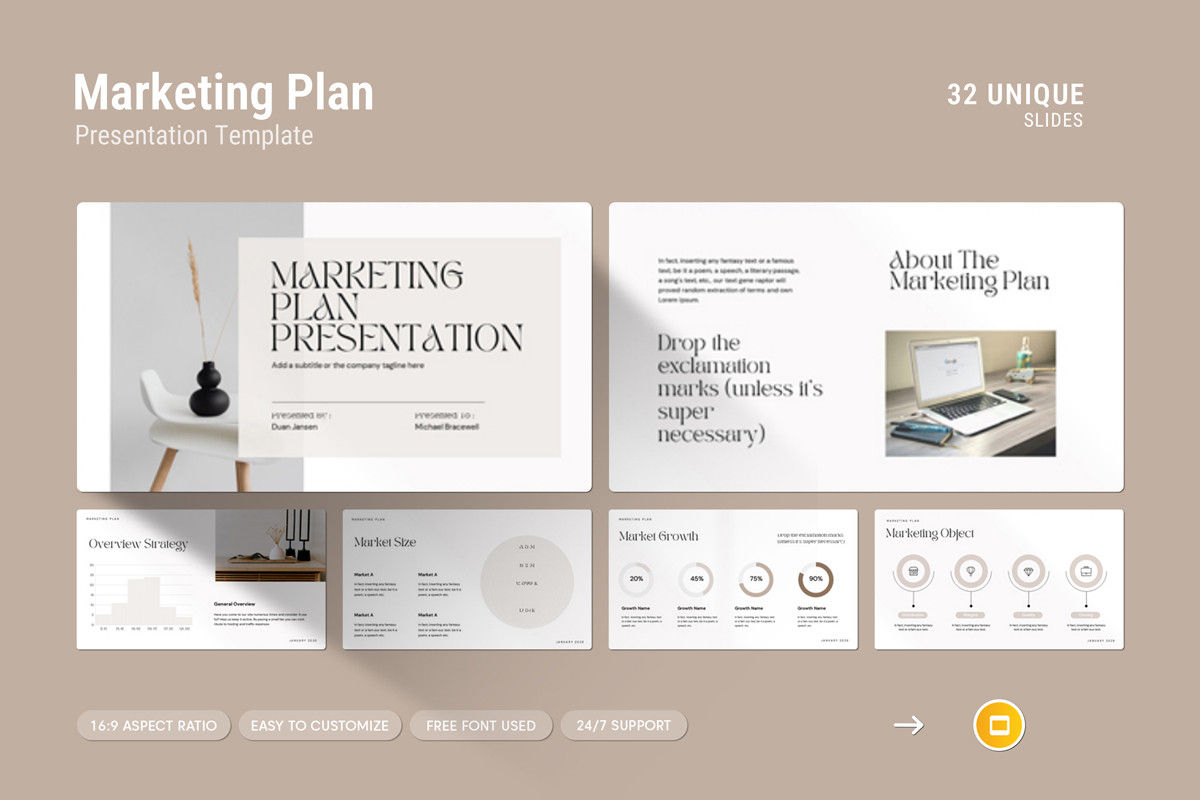
Using Minimalistic Presentation Template Canva for Visual Customization
A minimalistic presentation template canva can be practical for users who want to quickly adapt layouts, imagery, and brand elements within a visual editing environment. The most important step is resisting the temptation to add every available design feature.
Start with the existing layout and ask what already works. Change the content first. Then adjust colors and typography only where necessary. If a visual effect does not clarify the message, it probably does not need to be added.
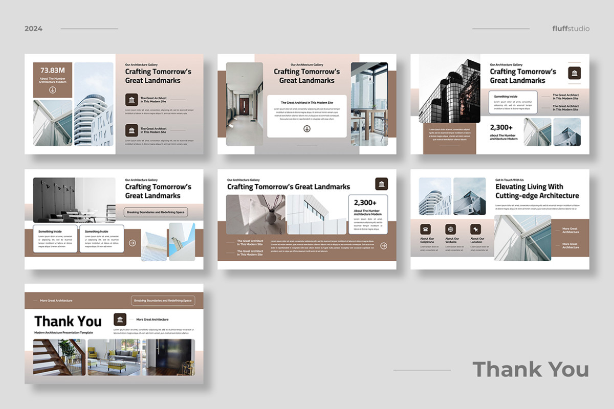
Minimalistic Presentation Templates to Customize Without Losing Consistency
The most useful minimalistic presentation templates to customize provide flexibility while protecting the design system. You should be able to replace content without accidentally creating misaligned text, inconsistent colors, or uneven spacing.
Use this practical customization sequence:
- Define the presentation’s primary objective.
- Create a simple story outline before editing slides.
- Choose layouts based on the type of information.
- Replace placeholder titles with clear takeaways.
- Add supporting evidence and visuals.
- Apply your brand colors carefully.
- Review spacing and alignment.
- Remove anything that does not support the message.
Typography: The Foundation of Minimal Presentation Design
Typography carries more responsibility in a minimalist deck because there are fewer decorative elements competing for attention. A strong font hierarchy can make a simple slide feel intentional, while poor typography can make an otherwise polished layout feel unfinished.
Use size, weight, and spacing to distinguish between major ideas and supporting information. Avoid using several unrelated typefaces simply to create variety. One well-chosen font family with different weights is often enough.
For example, a large statement can communicate the central insight, a medium-weight subtitle can explain the context, and smaller text can provide supporting detail. This creates hierarchy without requiring additional shapes or decorations.
Color Strategy for Minimalist Presentation Templates
A limited color palette is one of the most recognizable characteristics of a minimalist deck. This does not mean every presentation must be black and white. It means colors should have clear jobs.
A practical system may include a neutral background, a dark text color, and one accent color. The accent should be reserved for important numbers, selected data points, calls to action, or other information that deserves attention.
Using color consistently is more effective than constantly introducing new shades. If one color means growth on one slide and warning on another, the audience has to reinterpret the visual system.
How to Present Data with a Minimalist Approach
Data-heavy presentations are often where minimalism becomes most valuable. A default chart may include excessive grid lines, labels, legends, colors, and visual effects. The result can be technically accurate but difficult to understand quickly.
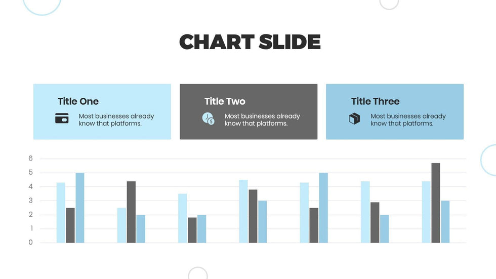
Instead, identify the point your data should communicate. Reduce secondary elements, highlight the most relevant series, and use a title that explains the takeaway.
For example, rather than labeling a chart simply as “Quarterly Revenue,” use a message such as “Revenue growth accelerated during the second half of the year.” The chart then supports a conclusion instead of forcing the audience to discover the point alone.
Practical Slide Examples for Different Presentation Goals
Startup or investor presentation
Use a clear progression: problem, audience, solution, market, business model, progress, team, and next step. Keep each slide focused on advancing the story.

Portfolio presentation
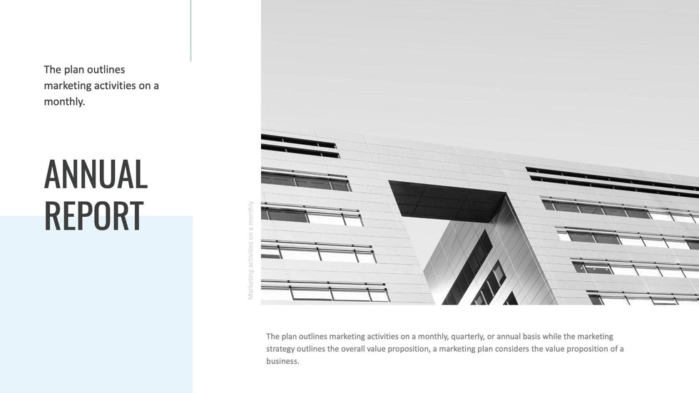
Minimalism works well for portfolios because the project itself can remain the visual focus. Use large imagery, concise descriptions, and enough space around each project to create emphasis.
Team presentation
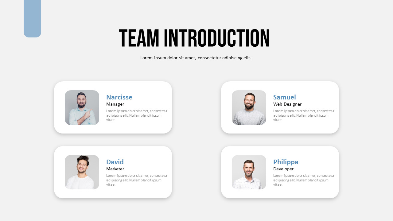
For team introductions, keep names, roles, photographs, and short descriptions aligned consistently. Avoid giving each profile a different decorative style.
Product presentation
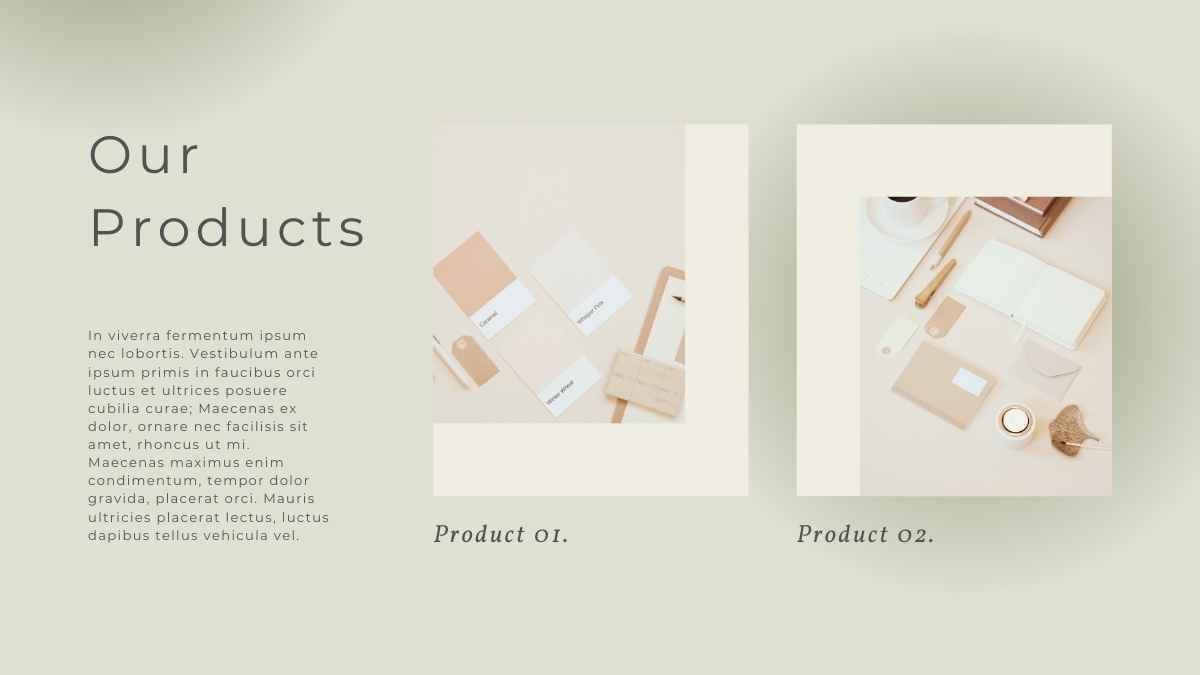
Use one strong product image, a concise value statement, and a small number of supporting benefits. Minimalism helps the product become the focal point.
Minimalistic Presentation Templates from SlidesCarnival and Other Design Sources
When evaluating minimalistic presentation templates from slidescarnival or other template collections, focus on the quality of the layout system rather than the cover slide alone. Examine the agenda, chart, timeline, team, comparison, and closing layouts.
A visually impressive cover does not guarantee that the rest of the deck will support real presentation needs. A strong template should make it easier to build a complete narrative from beginning to conclusion.

Common Mistakes When Using a Simple Minimalist PPT Template
A simple minimalist ppt template can still produce a cluttered presentation if the editing process lacks discipline. Minimalism depends on choices made after the template is selected.
- Adding too much text: Keep detailed explanations for spoken narration or supporting material when appropriate.
- Using too many fonts: Build hierarchy through size and weight instead.
- Filling every empty area: Space is part of the composition.
- Using decorative visuals without purpose: Images should reinforce the message.
- Changing layouts randomly: Repetition creates familiarity and professionalism.
- Making every element equally important: Establish a clear focal point.
Advanced Tips for More Persuasive Minimalist Slides
Experienced presenters can take minimalist design further by thinking about pacing. A presentation is not only a collection of slides; it is a sequence of visual moments. Some slides can introduce a bold statement, while others can provide evidence, comparison, or transition.
Vary the rhythm without abandoning consistency. A full-width image can follow a text-focused slide. A large number can introduce a data section. A simple divider can give the audience a visual pause before a new topic.

Another advanced technique is to design for the viewing environment. A presentation shown on a large conference screen can support different text sizes than one viewed through a video call. Always consider distance, screen size, and audience conditions.
FAQ About Minimalistic Presentation Template Design
What is the main purpose of a Minimalistic Presentation Template?
The purpose is to create a clear visual environment where the audience can quickly identify the most important information. Minimalism reduces unnecessary distractions and strengthens hierarchy.
Are minimalist presentation templates suitable for business use?
Yes. They are particularly useful for proposals, strategy decks, reports, investor presentations, company profiles, and executive summaries because clarity is often more valuable than decoration.
How many colors should a minimalist presentation use?
There is no universal number, but a restrained palette is generally easier to manage. A neutral foundation with one or two supporting accent colors can create strong consistency.
Can minimalist slides include images?
Absolutely. Minimalism does not mean avoiding images. It means choosing images intentionally and giving them enough space to create impact.
How can I make a minimalist presentation feel less empty?
Improve hierarchy rather than adding random decoration. Strong typography, meaningful imagery, balanced spacing, and a clear focal point can make a slide feel complete without becoming crowded.
What is the best way to customize a template?
Start with the message and story structure. Replace placeholder content, organize the visual hierarchy, then adjust branding and secondary design details. This keeps the presentation focused on communication.

Final Recommendations
A strong Minimalistic Presentation Template should help your ideas become easier to see, understand, and remember. Choose a layout system that matches your presentation purpose, maintain consistent typography and colors, use space intentionally, and make every slide support a specific part of your story.
The most effective minimalist presentation is not the one with the fewest elements. It is the one in which every remaining element has a clear reason to exist. When content, hierarchy, spacing, and visuals work together, even a simple deck can communicate with confidence, clarity, and lasting impact.