A creative brochure is more than a collection of images and text. It is a practical marketing tool that helps businesses introduce their brand, explain their services, showcase products, and encourage potential customers to take action. When designed well, a brochure can communicate important information quickly while creating a strong and memorable visual impression.
Whether you need a brochure for a company, event, product launch, real estate business, restaurant, agency, or professional service, the right design can make your message easier to understand. A thoughtful combination of layout, typography, imagery, colors, and concise content can turn an ordinary printed document into a powerful brand asset.
This guide explains what makes a creative brochure effective, how to structure the content, which design elements matter most, and how to create a professional brochure that works for both print and digital distribution.
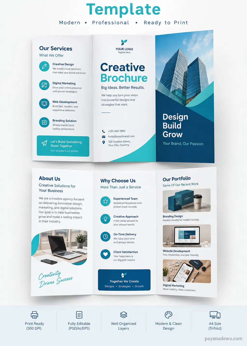
What Is a Creative Brochure?
A creative brochure is a professionally designed marketing document that presents information in an attractive and easy-to-follow format. Unlike a basic information sheet, it combines visual storytelling with carefully organized content to guide readers through a brand, product, service, or offer.
Brochures can be printed or distributed digitally as PDF files. Common formats include bi-fold, tri-fold, gate-fold, and multi-page brochure designs. Each format provides different opportunities for organizing information and creating a natural reading experience.
The goal is not simply to make a brochure look attractive. The design should support the message. Every headline, image, icon, color, and section should help readers understand what the business offers and why they should care.
Why a Creative Brochure Matters for Business
In a competitive market, businesses need marketing materials that communicate value quickly. A well-designed brochure can help achieve that goal because readers can scan the layout and immediately identify important information.
A strong brochure can help you:
- Introduce your business and brand identity.
- Explain products or services clearly.
- Highlight key benefits and unique selling points.
- Present important information in an organized format.
- Build trust through professional visual presentation.
- Provide contact information and clear calls to action.
- Support sales presentations, events, exhibitions, and promotional campaigns.
A brochure can also reinforce your brand identity. Consistent colors, typography, imagery, and messaging make your business easier to recognize across different marketing channels.
Key Elements of an Effective Creative Brochure
Good brochure design depends on several elements working together. A visually impressive layout can still be ineffective if the content is confusing or the call to action is difficult to find.
1. A Strong Cover Design
The cover creates the first impression. It should immediately communicate the subject of the brochure while giving readers a reason to continue reading.
Use a clear headline, relevant visual, recognizable logo, and enough white space to prevent the cover from feeling crowded. A strong cover does not need to explain everything. Its main purpose is to attract attention and establish the visual direction of the brochure.
2. Clear and Scannable Content
Most readers do not read promotional materials word for word. They scan headings, short paragraphs, bullet points, and highlighted information first.
For that reason, divide the content into logical sections. Use concise paragraphs and descriptive headings. Keep the most important information easy to find.
3. High-Quality Images
Images can communicate ideas faster than large blocks of text. Product photography, lifestyle images, team photos, illustrations, and branded graphics can all contribute to an effective brochure.
Choose images that support the message instead of using visuals simply to fill empty space. Images should also have sufficient resolution for the intended output, especially when the brochure will be professionally printed.
4. Consistent Brand Colors
Color plays an important role in visual communication. Your brochure should use a color palette that matches your existing brand identity.
Limit the number of dominant colors and use contrast strategically. For example, a neutral background can make a strong accent color stand out. Consistency also makes the brochure feel more professional and connected to other marketing materials.
5. Readable Typography
Typography affects both appearance and usability. Choose fonts that are easy to read at the final printed size. Use different font weights and sizes to establish a clear hierarchy between headings, subheadings, body text, and supporting information.
Avoid using too many typefaces. In most cases, two complementary font families or a single versatile type family are enough for a polished result.
How to Structure a Creative Brochure
A good brochure follows a logical information flow. The exact structure depends on your goal, but the following approach works well for many businesses.
Front Cover
Start with the business name or logo, a strong headline, and an engaging image. Add a short statement that communicates the main value of the company, product, or service.
Introduction or About Section
Briefly explain who you are, what you do, and who you serve. Focus on the information that matters most to your target audience rather than writing a long company history.
Products or Services
Present your main offerings in separate sections. Use short descriptions, icons, images, or feature lists to make each offering easy to understand.
Benefits and Differentiators
Explain why customers should choose your business. Focus on outcomes and benefits rather than simply listing features. This section is particularly useful for building trust and supporting purchase decisions.
Call to Action
Finish with a clear next step. Depending on your objective, you might encourage readers to visit a website, request a quotation, make a booking, contact a sales team, visit a store, or follow a social media account.
Creative Brochure Ideas for Different Businesses
There is no single brochure style that works for every industry. The design should reflect the audience and the personality of the brand.
- Corporate businesses: Use a clean layout, structured information, professional photography, and restrained colors.
- Creative agencies: Experiment with bold typography, unusual compositions, colorful graphics, and portfolio-focused layouts.
- Restaurants: Highlight signature dishes, menus, promotions, location details, and attractive food photography.
- Real estate companies: Feature property images, key specifications, location information, and contact details.
- Travel businesses: Use destination photography, itinerary highlights, travel benefits, and booking information.
- Healthcare providers: Prioritize clarity, trust, accessibility, service information, and easy-to-find contact details.
- Educational organizations: Present programs, benefits, facilities, testimonials, and enrollment information in an approachable layout.
Practical Tips for Better Brochure Design
Creating a professional brochure does not mean adding more design elements. In many cases, simplicity produces a stronger result.
- Start with a clear objective: Decide what you want readers to do after viewing the brochure.
- Know your audience: Choose visuals, language, and design elements that match your target customers.
- Use white space: Empty space gives important content room to breathe and improves readability.
- Create visual hierarchy: Make the most important information visually dominant.
- Keep paragraphs short: Short blocks of text are easier to scan, especially on digital screens.
- Use consistent spacing: Align headings, images, icons, and text to create a professional structure.
- Proofread everything: A spelling or contact-information error can damage credibility.
- Check the final output: Review the brochure at its actual print size before sending it to production.
Print vs. Digital Creative Brochure
A brochure intended for printing requires different preparation from one designed primarily for digital distribution. Printed brochures need appropriate dimensions, image resolution, margins, and bleed settings. Colors may also appear differently on paper than they do on a screen.
For digital brochures, consider how the document will appear on phones, tablets, and computers. Interactive links can be useful because readers can move directly from the brochure to a website, booking page, product page, or contact form.
If you plan to use the same design for both purposes, create the layout with both experiences in mind. Keep text readable and make sure important contact information remains clear at different screen sizes.
How to Make Your Brochure More Engaging
An engaging brochure should tell a simple visual story. Instead of presenting unrelated sections, connect each part so that readers naturally move from one idea to the next.
For example, begin with a customer problem, introduce your solution, explain the benefits, provide supporting evidence, and finish with a strong call to action. This approach makes the brochure feel purposeful rather than simply decorative.
You can also strengthen the design with testimonials, statistics, product highlights, icons, comparison points, or short case studies. However, every added element should have a clear purpose. Too many competing details can reduce the impact of the main message.
Common Creative Brochure Mistakes to Avoid
Even an attractive brochure can fail if the design prioritizes decoration over communication. One common mistake is using too much text. Readers may lose interest before reaching the most important information.
Another problem is inconsistent branding. Different fonts, colors, image styles, or visual treatments can make the brochure appear unfinished. Low-quality images and weak contrast can also reduce professionalism.
Finally, avoid hiding your call to action. A reader should know exactly what to do next. Make the website, phone number, email address, QR code, or booking information easy to locate.
Why Use a Creative Brochure Template?
A professionally structured brochure template can significantly speed up the design process. Instead of creating every element from scratch, you can begin with an established layout and customize the text, images, colors, logo, and branding.
A good template provides a useful foundation while still allowing creative flexibility. It can help maintain consistent spacing, alignment, typography, and visual hierarchy across the entire brochure.
Templates are especially useful for small businesses, freelancers, marketers, designers, and teams that need professional promotional materials without spending excessive time building a layout from the beginning.
Final Thoughts on Creative Brochure Design
A successful creative brochure combines attractive design with clear communication. The strongest brochures do not simply look professional. They help readers understand a business, recognize its value, and take the next step.
Start with a clear purpose, understand your audience, organize the information logically, and use design elements that support your message. Pay close attention to typography, imagery, spacing, color, and calls to action. Whether you are creating a printed marketing brochure or a digital brochure PDF, these principles can help you produce a result that is both visually engaging and genuinely useful.
With the right structure and a flexible brochure template, you can create marketing material that strengthens your brand and communicates your message with confidence.