A great first impression does not require an elaborate design. In fact, a minimalist business card can communicate professionalism, confidence, and creativity with just a few carefully chosen elements. By combining clean typography, balanced spacing, and essential contact information, you can create a card that looks modern and remains easy to read.
Whether you are a freelancer, entrepreneur, designer, consultant, or small business owner, a minimalist business card helps people remember who you are and what you do. Moreover, its timeless appearance works well across many industries, from technology and finance to photography and creative services.
In this guide, you will discover the benefits of minimalist business card designs, the essential elements to include, practical design tips, and ways to prepare a professional card for printing. You will also learn how to choose a template that reflects your brand without making the design unnecessarily complicated.
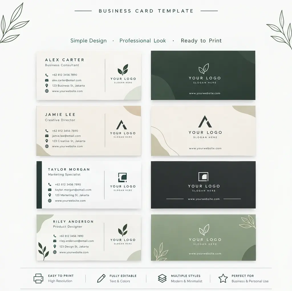
What Is a Minimalist Business Card?
A minimalist business card is a compact professional card that focuses on clarity, simplicity, and purposeful design. Instead of using excessive graphics, multiple fonts, or decorative elements, it highlights the information people need most.
Typical features include a limited color palette, generous white space, readable typography, and a clean layout. Some designs also feature a small logo, a subtle geometric shape, or a simple line illustration to establish a distinctive visual identity.
However, minimalist does not mean boring or incomplete. Every element should serve a purpose. When you remove unnecessary details, your name, brand, and contact information become easier to recognize.
Why Choose a Minimalist Business Card?
A simple business card offers several advantages for professionals who want to present a consistent and memorable brand identity.
1. Create a Professional First Impression
Your business card often represents your brand before someone visits your website or speaks with you again. A well-organized layout communicates attention to detail and professionalism. Consequently, clients and potential partners can focus on your business rather than distracting design elements.
2. Improve Readability
Business cards have limited space, so readability matters. A minimalist layout gives your name, job title, phone number, and email address enough room to stand out. In addition, clear typography makes the information easier to scan during networking events and meetings.
3. Support a Consistent Brand Identity
Simple designs are easier to coordinate with your website, social media profiles, letterheads, and marketing materials. For example, using the same logo, typography, and brand colors across these platforms creates a cohesive visual identity.
4. Offer Timeless Visual Appeal
Trendy graphics can become outdated quickly. By contrast, a clean business card design often remains attractive for years. Neutral colors, balanced spacing, and straightforward typography can adapt to changing brand needs without requiring a complete redesign.
5. Work Across Different Industries
Minimalist business cards suit a wide range of professions. A consultant might choose a charcoal-and-white design, while a florist could prefer soft sage green and cream. Similarly, a technology professional might use a geometric logo with a restrained color palette.
Essential Elements of a Minimalist Business Card
Before choosing a template, decide which information your card needs to communicate. A successful design includes the essentials without overcrowding the available space.
Your Name and Professional Title
Your name should be one of the most noticeable elements. Add a concise job title or business role underneath it to explain what you do. For example, you might use Business Consultant, Graphic Designer, Marketing Specialist, or Freelance Photographer.
Your Business Logo
A simple logo reinforces brand recognition. Place it near your name or in a separate area of the card, depending on the layout. If you do not have a logo yet, a clean wordmark or understated monogram can be an effective alternative.
Essential Contact Information
Include the details people need to contact you. Depending on your business, these may include:
- Your professional phone number.
- Your business email address.
- Your website URL.
- Your company name and job title.
- Your business address, when relevant.
- A QR code linking to your portfolio or digital contact page, if useful.
Nevertheless, avoid including every available contact channel. Choose the most useful details for your audience and remove anything that does not support your networking goals.
Brand Colors and Typography
Choose one or two primary colors and, if necessary, a complementary accent. Black, white, beige, navy, gray, and muted green are popular options for clean, professional designs.
For typography, prioritize legibility over decoration. One font family with different weights can create a clear hierarchy. Alternatively, combine two complementary typefaces, such as a modern sans-serif for contact details and a restrained serif for your name.
How to Design a Minimalist Business Card
Creating a professional card becomes easier when you follow a simple design process. Start with the information you need, then build the layout around it.
Step 1: Define Your Brand Style
Consider your industry, audience, and personality. A corporate brand may benefit from a structured monochrome layout, whereas a wellness or lifestyle business might use organic shapes and natural colors. Your design should reflect your brand rather than simply follow a trend.
Step 2: Choose a Clean Layout
Arrange the information in a logical order. Put your name and role near the top, then group your contact details together. Leave enough space between sections so that each element remains easy to identify.
You can also use the reverse side for a logo, a short tagline, or a QR code. However, keep both sides consistent in color, spacing, and visual style.
Step 3: Use White Space Intentionally
White space is the empty area surrounding text and graphics. It gives the design room to breathe and helps important details stand out. Remember that white space does not have to be white; cream, pale gray, or another light background can achieve the same effect.
Step 4: Select Readable Fonts
Use fonts that remain legible at small sizes. Avoid overly thin lettering, elaborate scripts, and tightly spaced characters for essential contact information. As a practical starting point, consider approximately 8–10 pt for secondary details, then test a physical proof before approving the final design.
Step 5: Prepare the Card for Printing
Choose a standard business card size accepted by your printer. In many markets, a common size is approximately 3.5 by 2 inches, although dimensions vary by country and printing service.
Check the printer’s requirements for bleed, trim, safe margins, color mode, and file format. Keep important text away from cutting edges, use suitable image resolution, and review the final proof before ordering a full batch.
Minimalist Business Card Template Ideas
If you need inspiration, explore different minimalist styles before committing to one design. The best option depends on your profession, brand personality, and intended audience.
Black and White Business Cards
Black and white cards offer a classic, versatile appearance. Strong contrast makes text easy to read, while a simple logo or carefully positioned name adds visual interest. This style works particularly well for consultants, attorneys, architects, and corporate professionals.
Neutral and Beige Business Cards
Beige, ivory, and warm gray create a calm, understated aesthetic. These colors pair well with elegant typography and subtle lines. They are especially suitable for interior designers, boutique businesses, photographers, and lifestyle brands.
Sage Green Business Cards
Sage green and other muted natural tones offer a fresh alternative to traditional corporate colors. Combine them with cream backgrounds and simple botanical details for a refined result. This approach can suit wellness professionals, sustainable brands, and creative businesses.
Modern Geometric Business Cards
Geometric layouts use simple lines, circles, squares, or abstract shapes to create structure. Keep these details secondary to your contact information. When used carefully, geometric elements add personality without compromising the minimalist aesthetic.
Practical Tips for a Better Minimalist Business Card
Before finalizing your design, use the following checklist to improve both appearance and usability.
- Keep the layout focused: Include only information that supports your professional goals.
- Maintain strong contrast: Make sure text is easy to read against the background.
- Limit decorative elements: Use graphics only when they strengthen your brand identity.
- Check spelling carefully: Verify names, phone numbers, email addresses, and URLs.
- Choose suitable paper: Consider matte, uncoated, or textured stock to match your brand.
- Request a sample print: Review the physical card for readability, color accuracy, and finishing quality.
- Test any QR code: Confirm that it scans correctly and opens the intended destination.
- Keep digital and print versions consistent: Use matching brand colors and logos wherever possible.
Also, remember that a visually attractive card must remain practical. An elegant design loses its value if the text is too small, the paper is difficult to write on when needed, or the contact details are incorrect.
Common Minimalist Business Card Design Mistakes
Although minimalist design looks simple, it still requires careful decisions. Avoid these common mistakes when creating your card.
- Removing too much information: Simplicity should not prevent people from contacting you.
- Using extremely small text: Keep secondary details readable in the finished print.
- Choosing low contrast: Pale text on a pale background can be difficult to read.
- Adding too many fonts: Multiple typefaces can make the design feel inconsistent.
- Ignoring print specifications: Incorrect dimensions or missing bleed can cause unwanted trimming.
- Following trends without purpose: Select design elements that support your brand and audience.
Ultimately, the goal is not to make the card as empty as possible. Instead, create a clear visual hierarchy that helps people understand who you are and how to reach you.
Conclusion: Make a Lasting Impression with a Minimalist Business Card
A minimalist business card combines simplicity, readability, and professional style to create a memorable introduction. By focusing on essential information, thoughtful typography, balanced spacing, and consistent brand colors, you can design a card that looks polished without unnecessary decoration.
Start by defining your brand identity and selecting a layout that suits your profession. Next, organize your contact details, review the typography, and choose materials that reflect the quality of your business. Finally, check every detail and request a sample print before placing a larger order.
Whether you create your own design or customize a minimalist business card template, remember that the strongest results come from purposeful choices. Keep it clear, make it personal, and let your business card communicate your professionalism at a glance.