A strong brand is more than a memorable logo or an attractive color palette. It is the complete visual and verbal identity that shapes how people recognize, understand, and remember a business. A well-developed brand guideline helps ensure that every part of a brand communicates the same message, whether it appears on a website, social media, packaging, printed materials, or marketing campaigns.
As businesses grow, maintaining a consistent brand can become challenging. Different designers may use different fonts, colors, layouts, or logo variations. Marketing teams may also create content with different tones and visual styles. Without clear rules, these small differences can gradually make a brand look inconsistent and less professional.
A professional brand guideline solves this problem by creating a central reference for how a brand should be presented. It explains the correct use of visual elements, typography, colors, imagery, messaging, and other important brand assets. This makes it easier for internal teams, designers, marketers, and external partners to produce consistent materials.
Whether you are launching a new business or improving an existing identity, creating a clear brand guideline can make your brand easier to manage and more recognizable. The following guide explains what a brand guideline is, what it should contain, and how to create one that is practical and useful.
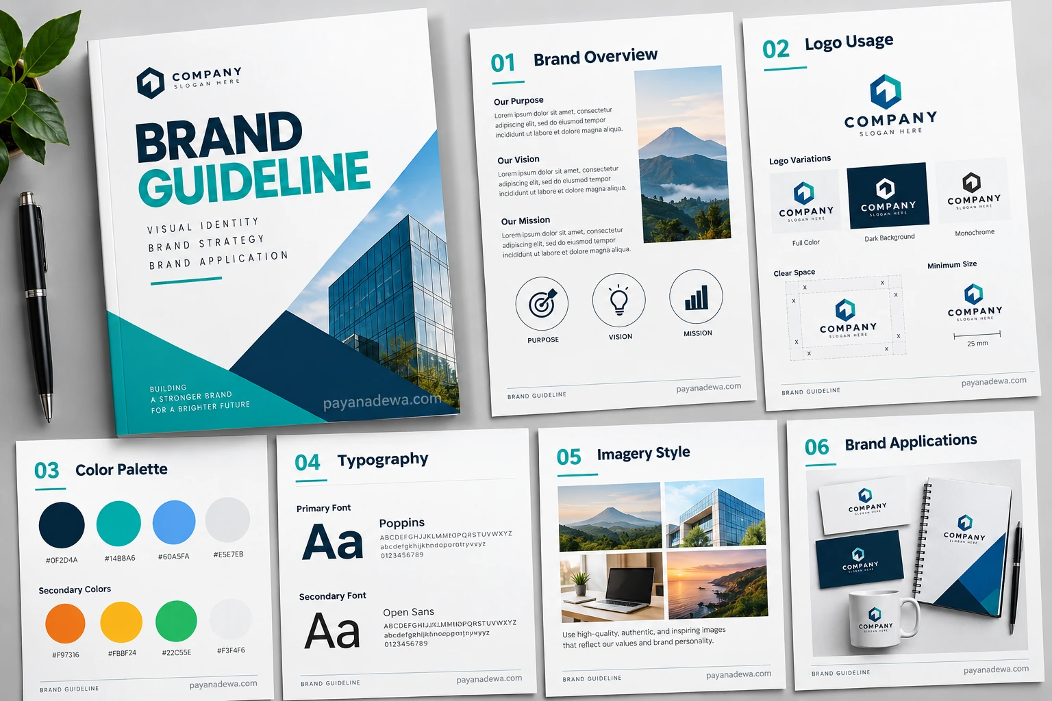
What Is a Brand Guideline?
A brand guideline is a document that defines the rules for presenting a brand consistently across different communication channels. It acts as a practical reference that explains how brand elements should look, feel, and work together.
Depending on the organization, a brand guideline can be a simple document of several pages or a comprehensive brand standards manual containing dozens of sections. The goal remains the same: create consistency while making brand implementation easier.
Why Brand Guidelines Matter
Brand consistency helps customers recognize a business more quickly. When the same colors, typography, imagery, logo treatment, and communication style appear across multiple platforms, the brand becomes easier to remember.
A brand guideline also saves time. Instead of repeatedly deciding which font, color, logo version, or image style to use, designers and content creators can refer to established standards.
- Creates a consistent visual identity.
- Improves brand recognition.
- Helps teams work more efficiently.
- Reduces incorrect use of logos and brand assets.
- Makes collaboration with designers easier.
- Strengthens professional brand presentation.
Essential Elements of a Brand Guideline
A useful brand guideline should contain the information people actually need when creating brand materials. The exact structure can vary, but several core elements are commonly included.
Brand Overview
Start with an overview of the brand. This section can explain the company’s purpose, vision, mission, values, personality, and positioning. It gives readers context before they begin using the visual identity.
The brand overview is particularly useful for new employees, freelance designers, marketing agencies, and business partners who need to understand the thinking behind the identity.
Logo Usage
The logo is one of the most recognizable elements of a brand, so its usage should be clearly documented. Show approved logo variations and explain where each version should be used.
A logo section can include the primary logo, alternative logo, monochrome version, minimum size, clear space, background requirements, and examples of incorrect usage.
- Do not stretch or distort the logo.
- Do not change approved logo colors.
- Do not place the logo on backgrounds that reduce readability.
- Maintain the required clear space around the logo.
- Use the appropriate logo variation for each application.
Brand Colors and Typography
Color and typography strongly influence how a brand feels. A clear color system and font hierarchy help different marketing materials maintain the same visual character.
Color Palette
A brand color palette normally contains primary colors and supporting secondary colors. Each color should have its relevant values, such as HEX, RGB, CMYK, and, when necessary, Pantone references.
Providing exact color values prevents designers from selecting slightly different shades across websites, advertisements, presentations, packaging, and printed materials.
A well-organized color section can also explain how colors should be combined. For example, a primary brand color might be used for important buttons and headings, while secondary colors support illustrations, backgrounds, or promotional materials.
Typography System
Typography is another important part of a brand identity. Your guideline should identify the primary and secondary typefaces and explain how they should be used.
Include examples for headings, subheadings, body text, captions, buttons, and other common content types. Establishing a clear hierarchy makes communication easier to read while maintaining a recognizable visual style.
Imagery and Graphic Style
Photography, illustrations, icons, patterns, and other graphic elements can significantly influence brand perception. A brand guideline should therefore explain the preferred visual direction.
Photography Guidelines
Photography guidelines can describe the preferred subjects, lighting, composition, colors, mood, and editing style. For example, a company may prefer authentic lifestyle photography with natural lighting rather than heavily staged stock images.
Clear photography standards help ensure that images from different campaigns still feel like they belong to the same brand.
Illustrations and Icons
If your brand uses illustrations or icons, explain their visual characteristics. Specify whether they should be minimal, geometric, hand-drawn, colorful, monochrome, outlined, or filled.
Consistent graphic elements can make digital products, presentations, websites, and marketing materials feel more connected.
Brand Voice and Messaging
A complete brand guideline does not have to focus only on visual design. Many modern brand standards also include verbal identity. This section explains how the brand should communicate with its audience.
Define the Brand Voice
Describe whether the brand should sound professional, friendly, confident, educational, conversational, sophisticated, energetic, or approachable. Clear descriptions make it easier for writers and marketers to produce consistent content.
You can also provide examples of preferred and discouraged language. This makes the guideline more practical because users can immediately understand how the brand voice should work in real situations.
- Define the preferred communication tone.
- Explain the language style to use.
- Identify important words and phrases.
- Provide examples of suitable messaging.
- Explain terminology that should be avoided.
Brand Applications
The best brand guideline does not stop after explaining individual elements. It also demonstrates how those elements work together in real-world applications.
Show Real Examples
Include examples such as business cards, letterheads, social media graphics, websites, presentations, packaging, signage, advertisements, and other relevant materials.
Real examples make the guidelines easier to understand. Instead of simply telling users how to apply the identity, the document demonstrates what correct implementation looks like.
Digital Brand Applications
Digital channels require additional considerations. A modern brand guideline may include website components, social media templates, email graphics, digital advertisements, presentation slides, and interface elements.
For websites and applications, accessibility should also be considered. Color combinations should provide sufficient contrast, typography should remain readable, and important information should not depend only on color.
How to Create an Effective Brand Guideline
Creating a brand guideline does not need to be complicated. The most important principle is to make the document clear enough that another person can use it without repeatedly asking questions.
1. Start With the Brand Strategy
Before documenting visual elements, clarify the brand’s purpose, audience, values, positioning, and personality. These decisions provide the foundation for the visual identity.
2. Organize the Visual Assets
Collect the approved logo files, color specifications, typography information, imagery examples, icons, illustrations, and other important assets. Remove outdated versions so users know which files are approved.
3. Establish Clear Rules
Explain not only what people should do but also what they should avoid. Incorrect logo examples, poor color combinations, and typography mistakes can be particularly helpful because they prevent common errors.
4. Use Practical Examples
Whenever possible, show real applications. Examples make abstract design rules much easier to understand and apply consistently.
5. Keep the Guideline Updated
A brand guideline should evolve as the business grows. Review it periodically and update outdated assets, applications, messaging, and design standards.
Brand Guideline vs. Brand Style Guide
The terms brand guideline and brand style guide are often used interchangeably. In many organizations, both refer to a document that establishes rules for maintaining brand consistency.
However, some companies use the term brand guideline for a broader document that includes strategy, messaging, visual identity, and applications, while a brand style guide may focus more heavily on visual design.
There is no single universal structure. What matters most is whether the document provides enough useful information for people to represent the brand accurately.
Tips for Making Your Brand Guideline More Useful
A beautiful document is not automatically a useful document. The best brand guideline balances visual presentation with practical instructions.
- Keep instructions simple and easy to scan.
- Use clear examples for important rules.
- Include both correct and incorrect applications.
- Use consistent terminology throughout the document.
- Provide downloadable brand assets when appropriate.
- Make the document accessible to designers and non-designers.
- Review the guideline whenever the brand identity changes.
It is also helpful to design the guideline itself using the brand identity. This turns the document into a practical demonstration of the standards it describes.
Common Brand Guideline Mistakes
One common mistake is creating rules that are too vague. Statements such as “use the logo correctly” do not provide enough guidance. Users need specific information about size, spacing, colors, backgrounds, and approved variations.
Another mistake is creating an overly complicated document that nobody wants to use. A brand guideline should be comprehensive enough to answer common questions while remaining easy to navigate.
Failing to update the document can also create problems. If a company changes its logo, typography, colors, or messaging but leaves the old guideline online, teams may continue using outdated assets.
Why a Brand Guideline Template Can Help
A brand guideline template provides a structured starting point for documenting a brand identity. Instead of designing every page from scratch, teams can begin with predefined sections and adapt them to their own requirements.
A good template can include sections for brand overview, logo usage, color palette, typography, imagery, brand voice, and applications. This makes it easier to create a professional document while reducing the amount of time required for layout planning.
Templates are especially useful for small businesses, startups, freelancers, agencies, and teams that need a practical brand standards document without building a complete system from the beginning.
Conclusion
A strong brand guideline provides the foundation for consistent and professional brand communication. It brings together the rules, examples, and resources needed to represent a brand accurately across different channels.
From logo usage and color palettes to typography, imagery, messaging, and real-world applications, every section should make the brand easier to understand and use. The document should be practical rather than simply decorative.
Whether you are developing a new identity or organizing an existing one, a clear brand guideline can improve consistency, save time, reduce design errors, and strengthen brand recognition. With the right structure and regular updates, it becomes a valuable resource that supports the brand as the business continues to grow.